 I want something exciting to say. We have finally exchanged with our house purchase last week! Anybody who bought the house before know what it means: we will have this house for sure and the date is set when we could move in. Yey!
Ever since we exchanged I have been dreaming how we are going to decorate the house and what alterations we are going to make. I have done this before and it was difficult and long process. But now I am not alone so hopefully we will settle much quicker, although we have baby on the way so I am interested to see how difficult it will be to do at least some DIY.
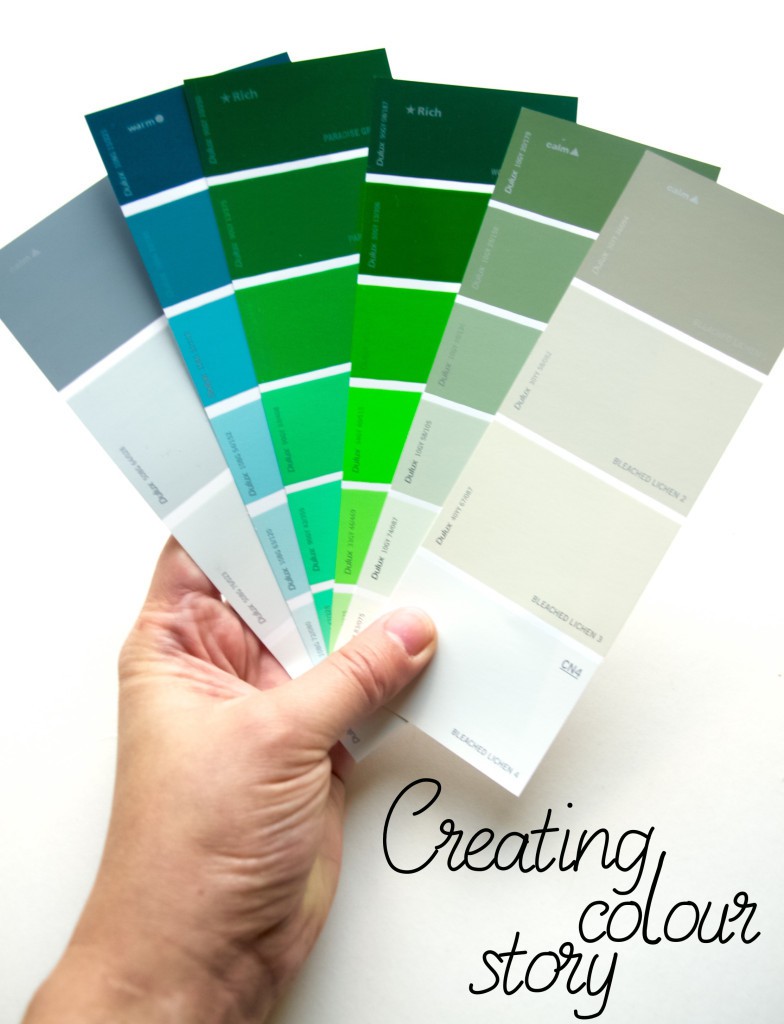
I have started planning the colours. Why? Because I really really want everything to “flow” in the house and right now I already need to buy few things that will match (such as sofa bed for my mum to sleep in when she is visiting her grandchild). I must admit last time I was decorating the house I did not put so much effort in planning the colour… because I went an easy way and chose neutral colours (mostly white). Yes, I did get many comments that it looked like a hospital to begin with, although I accessorised it with bold colours so it was cute at the end). This time I want to be braver and try darker colours (gosh, I am sooooo scared that it may make the place look small). But I so love those eccentric rooms that I see on Pinterest, so the challenge is on!
So how did I create this colour story? I am very lucky that I have gone to Uni to do fashion. During my course one of the things I have learned is exactly that, creating a colour story for a collection. It is of course very different to creating a colour story for the house, but the goal is the same: to create a set of colours that will be used through out the project (in this case the whole house). Of course I had failed many times before. One instance I remember quite clearly when my colour story looked like a rainbow just because I liked many colours and because I arranged them in colour wheel order. Another thing I learned is to identify what colours are main and which ones are for the accents. For better visualisation arrange the accent colours in small amounts that could be displayed in a item form (such as red lamp in the pic below). 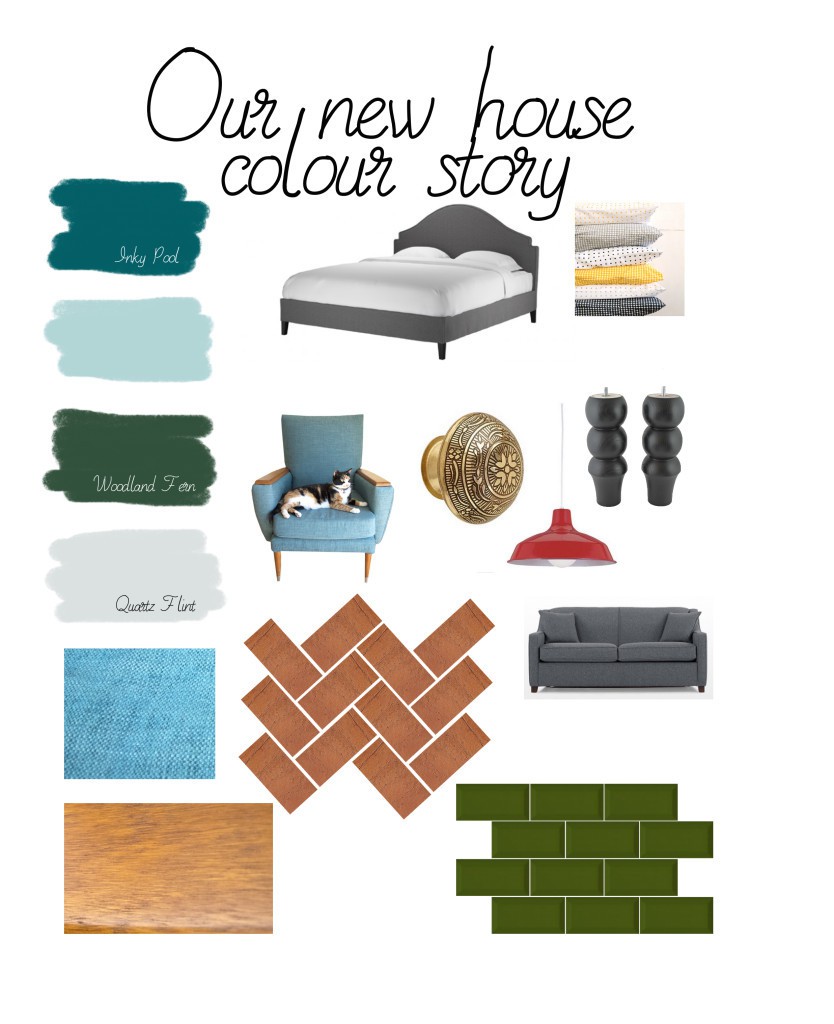 The third advise I can give is to look through some pictures of the house interiors and see what colour arrangement you like (Pinterest or Houzz have been a good source to me). For instance I like the feature wall colour in the pic below combined with bold colour picture display on it.
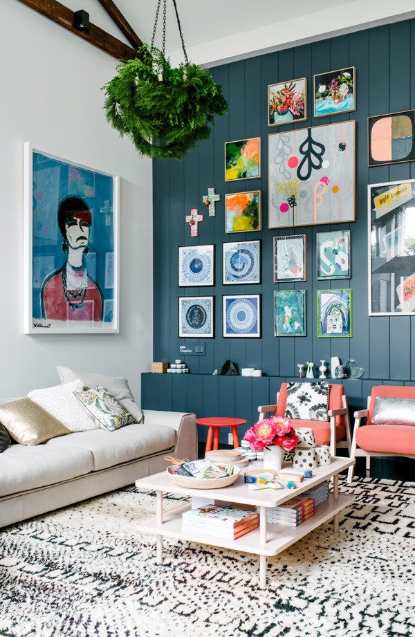 I like red as an accent colour but I might try this and paint bigger furniture in red as well. The pic bellow comes from Apartment Therapy.
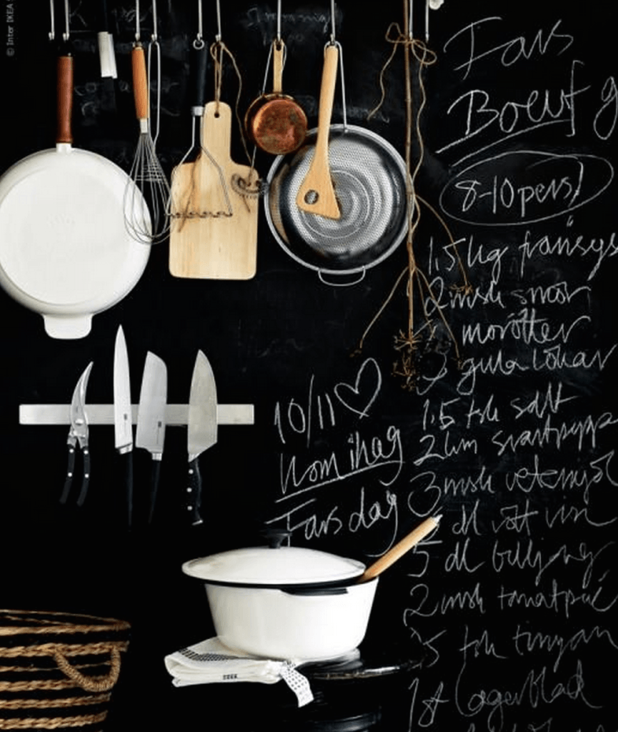
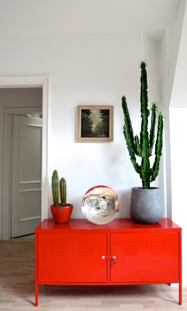 Although black is not a main colour in my colour story I would love to have a black board wall where we could scribble things! The pic bellow comes from IKEA website as an inspiration.
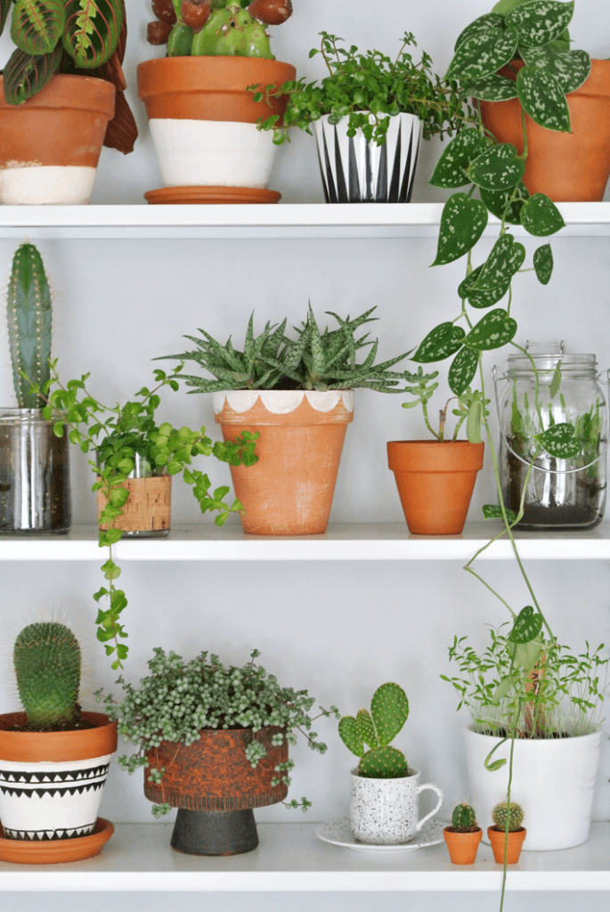
 And of course I would love to decorate the house with many plants! The pic bellow comes from My Attic.
 I hope you found this useful :-)
Rasa x


No comments yet.