Top

Archive | Arty Love

How to create your own palette using paint

Baltic sea colour palette, how to create palette using paint
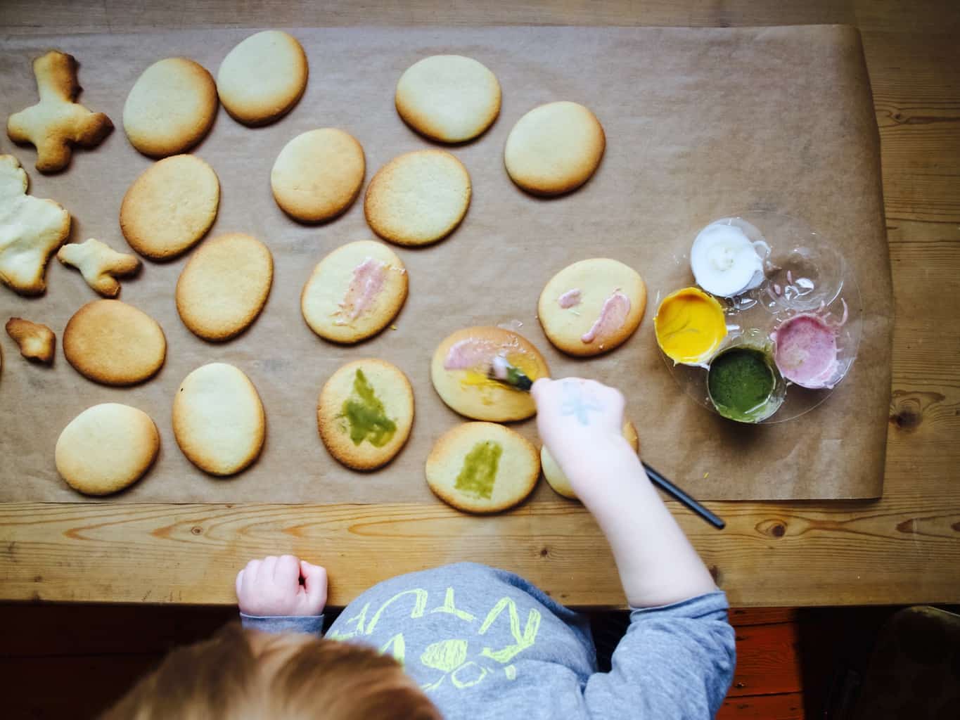
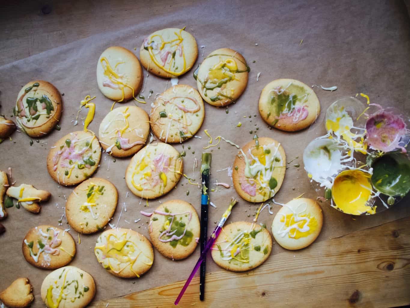
Colour palettes are useful little things when designing, especially interior design. Colour palettes are a selection of colours kept on a board or paper as a reference, ready mixed for specific project/artwork. It helps you to keep focus on the selection of the colours that create concept consistency through the design/painting process. There are many ways you can create a colour palette. You can use different material swatches or magazine cutouts to create 3D colour palette. Computer generated swatches are quite useful too and easy to create. However today we are talking how to make a colour palette by mixing your own paint. This technique is especially useful when you need to use some colours to create wall artwork or want a specific paint colour when painting the walls or furniture (of course these swatches can be successfully scanned at the paint shop for a larger quantity paint).Baltic sea colour palette, how to create palette using paint
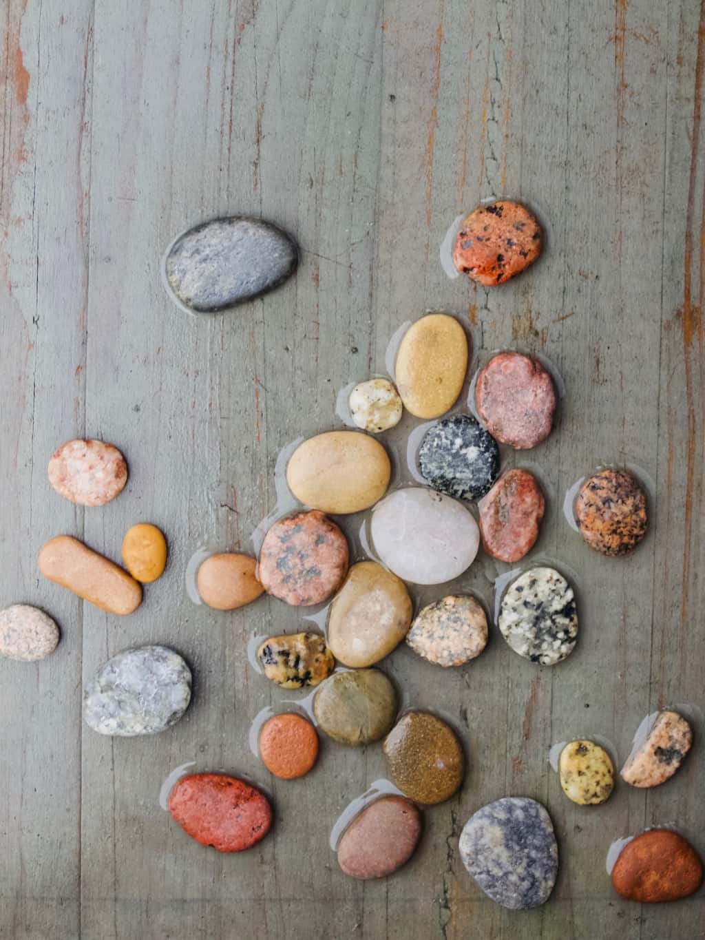
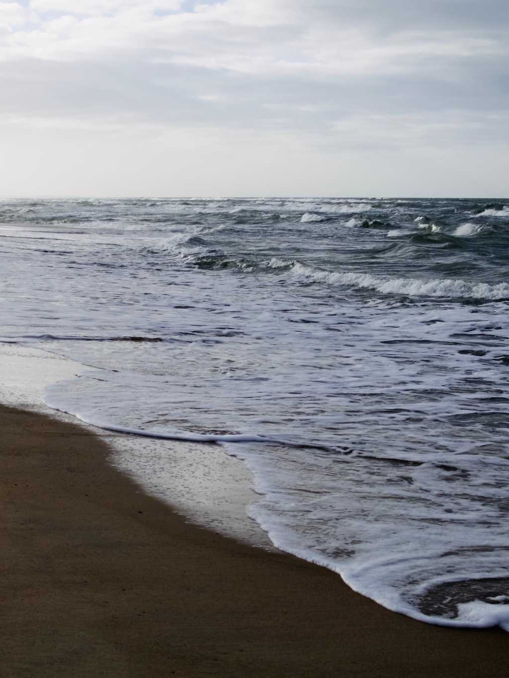
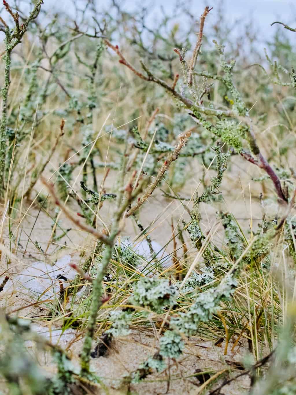
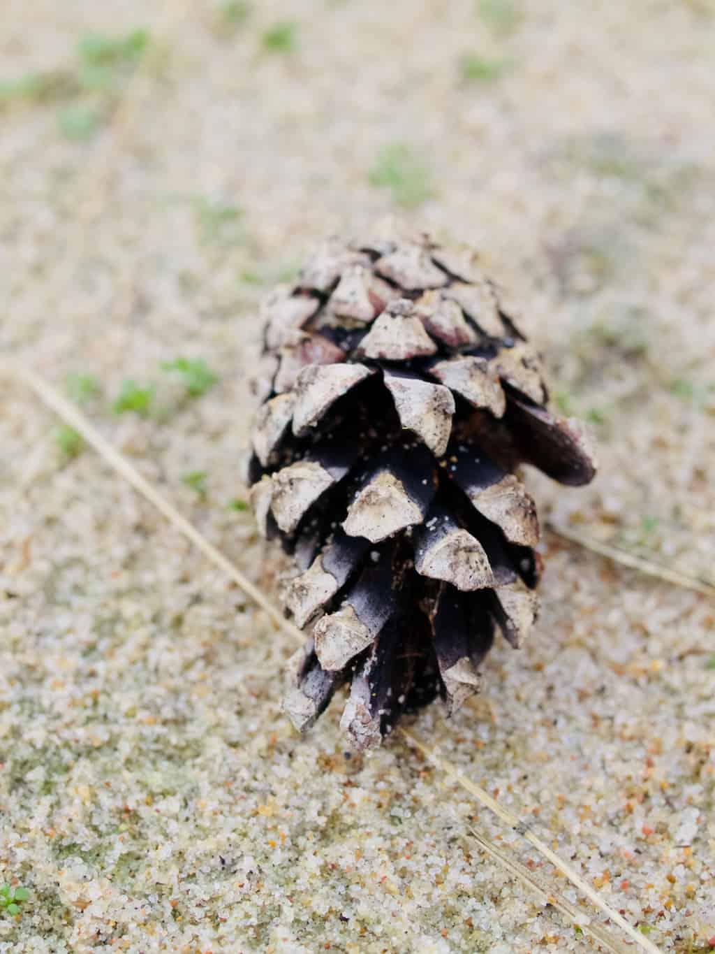
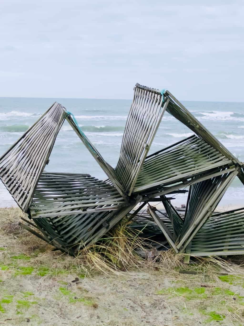
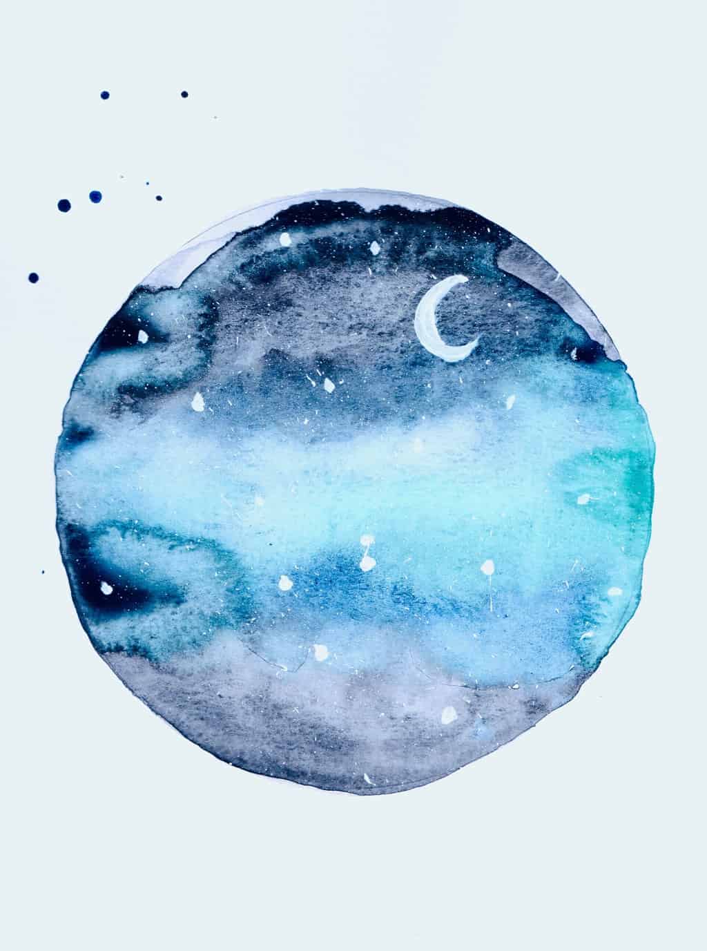
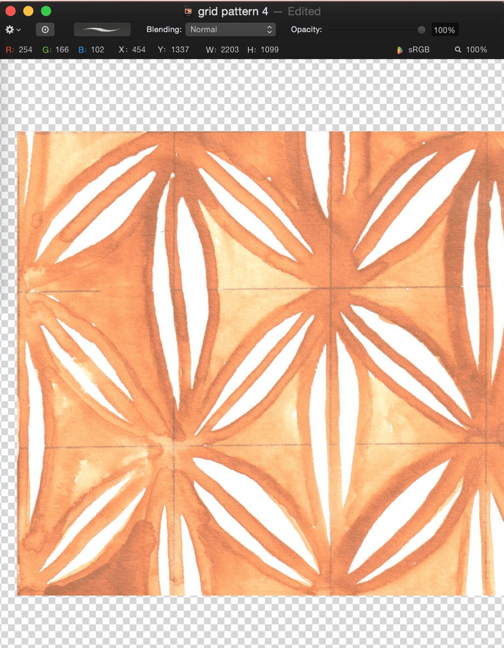
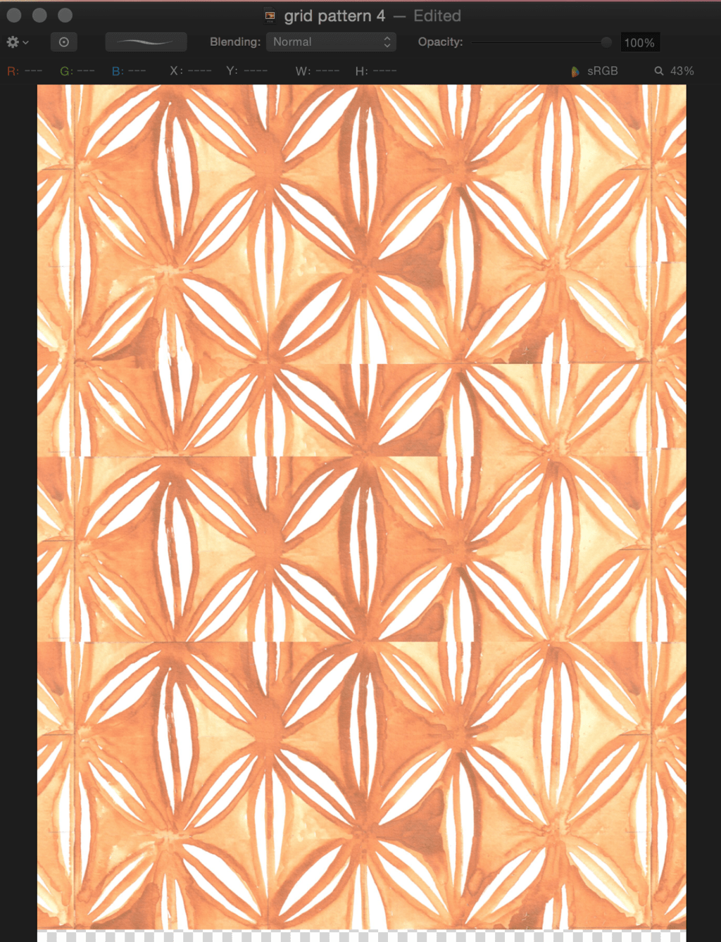
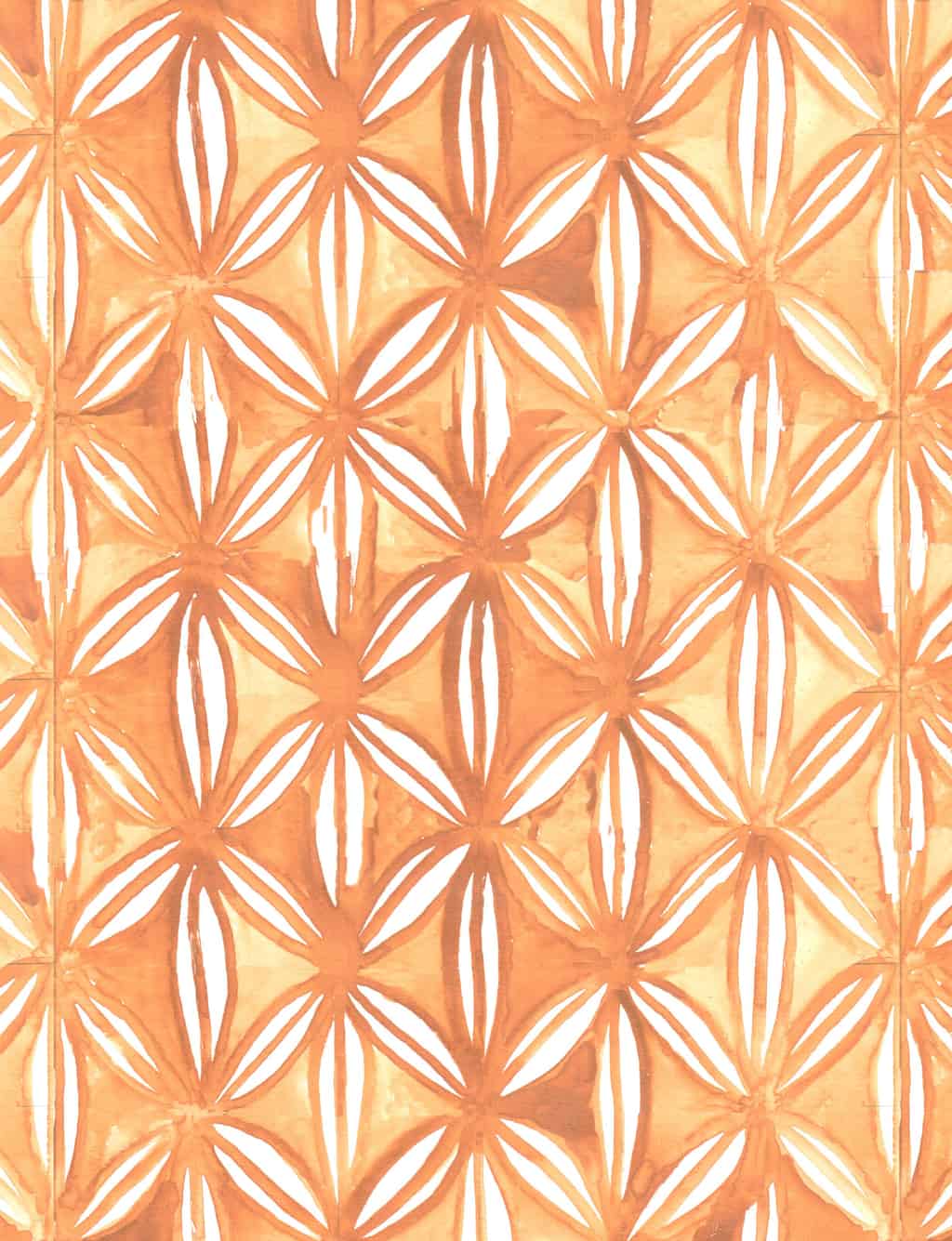
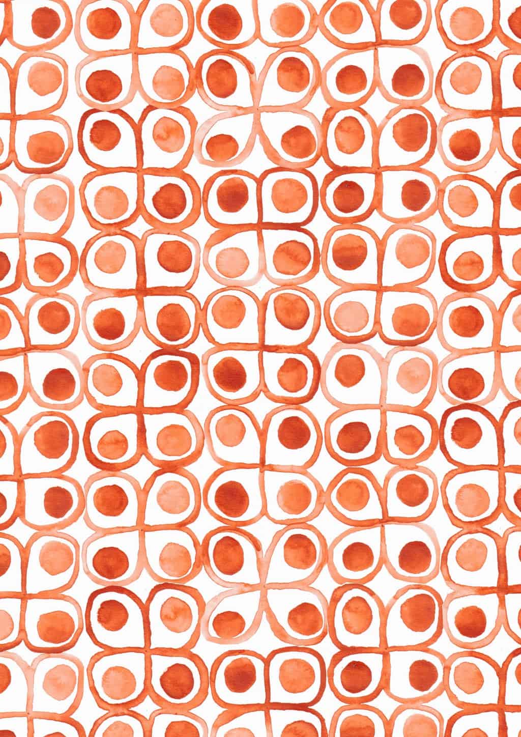
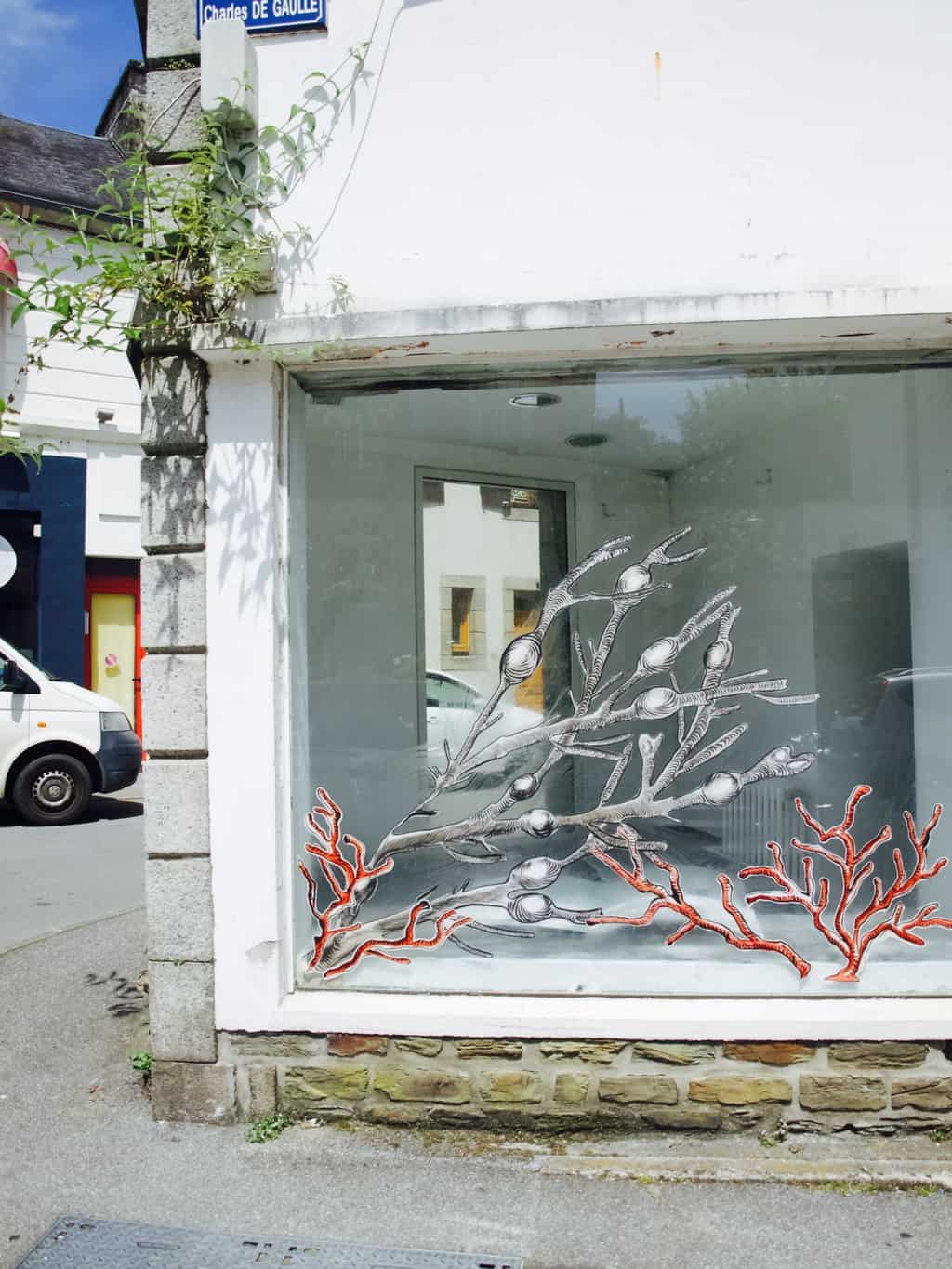
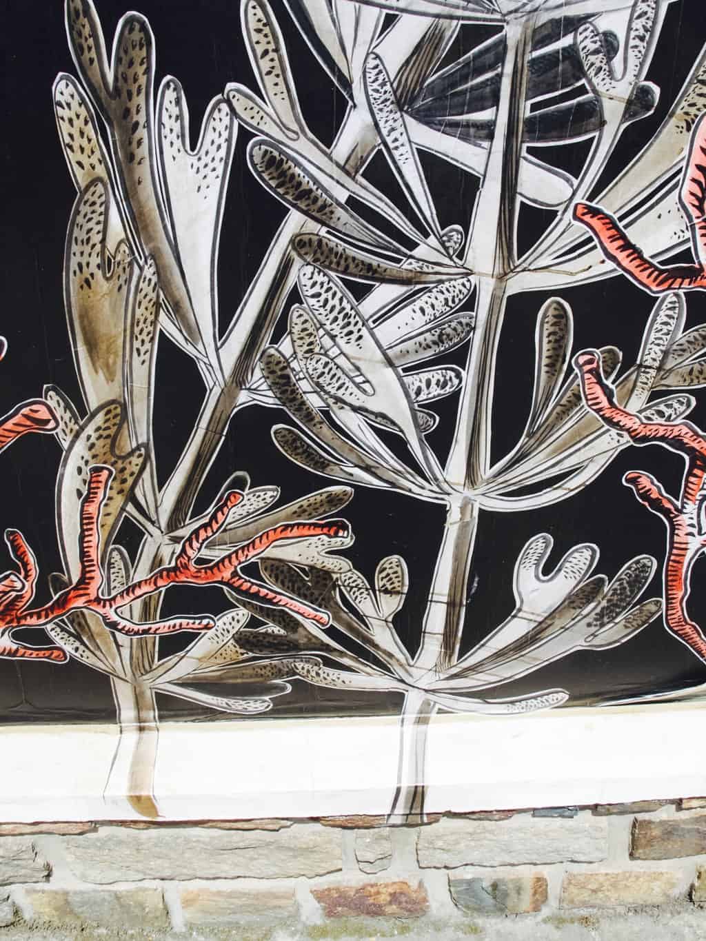
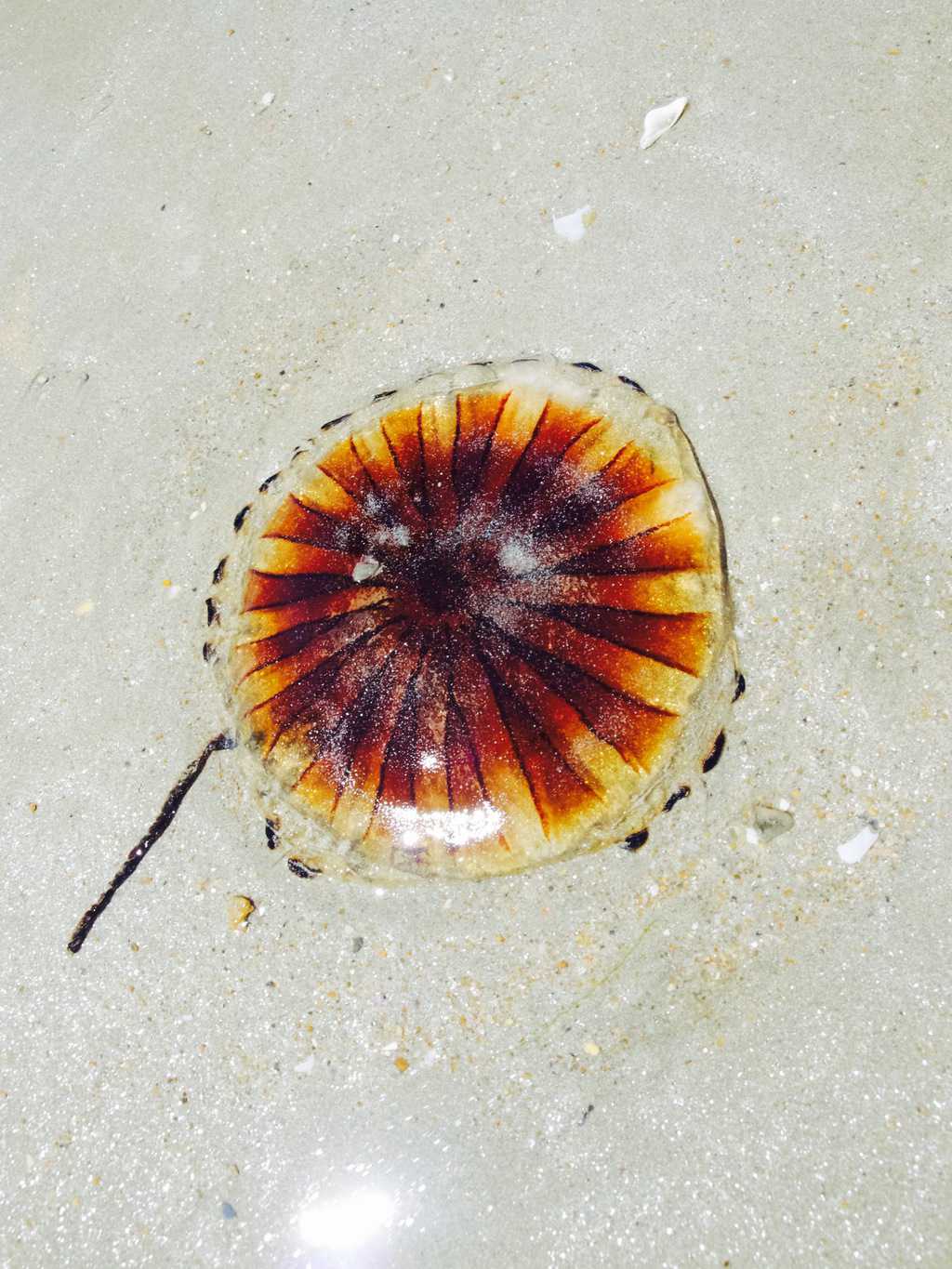
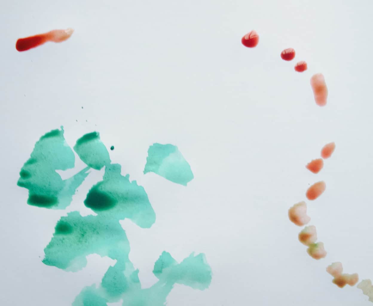
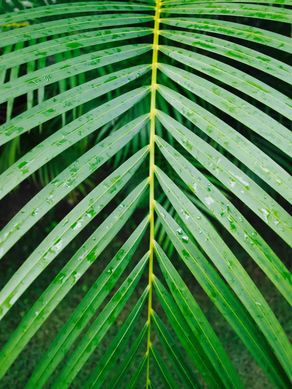
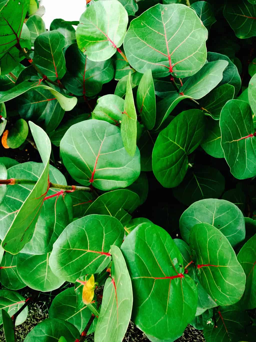
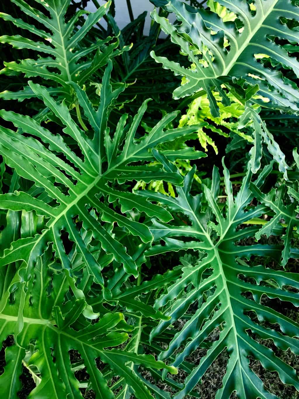
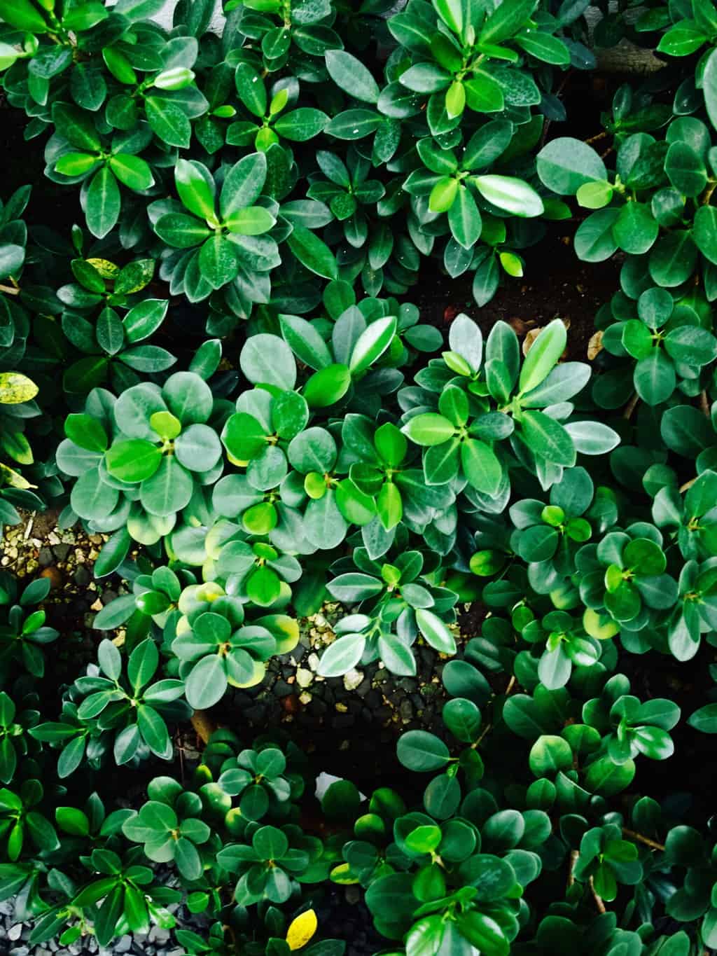
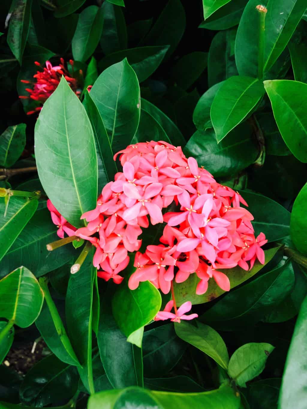
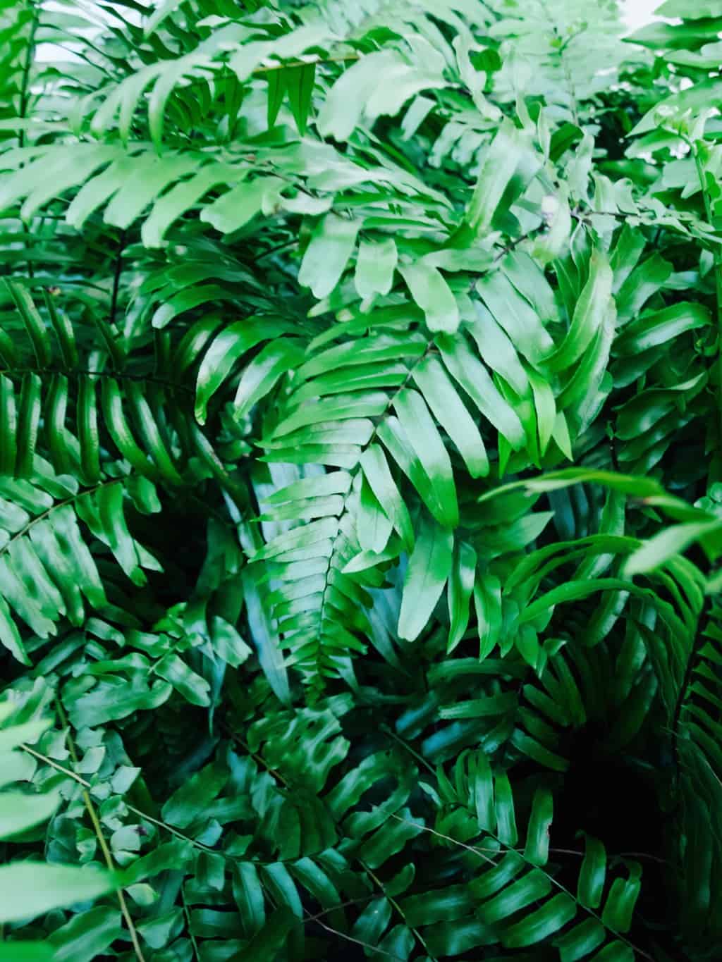
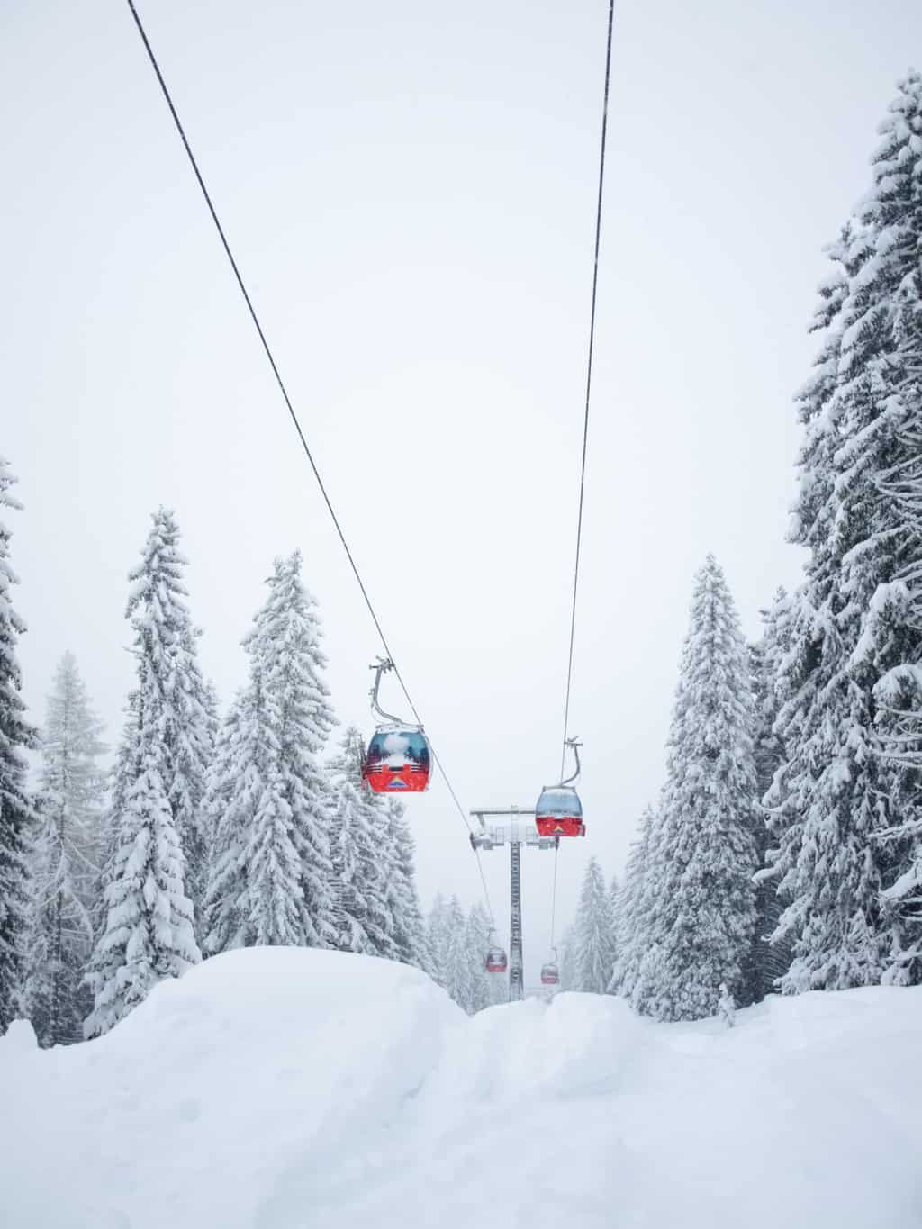
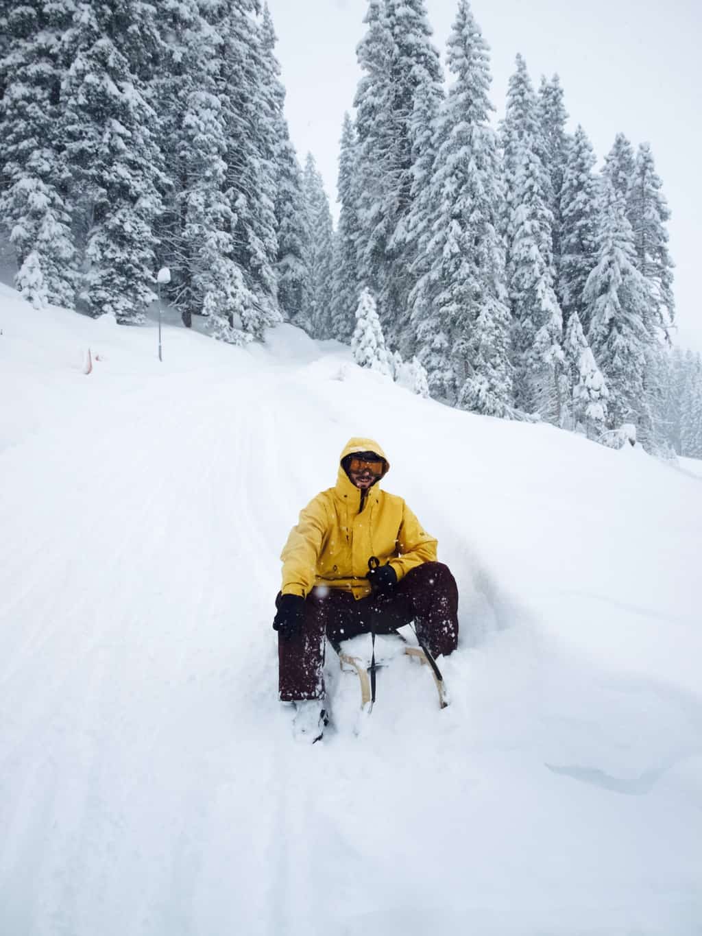
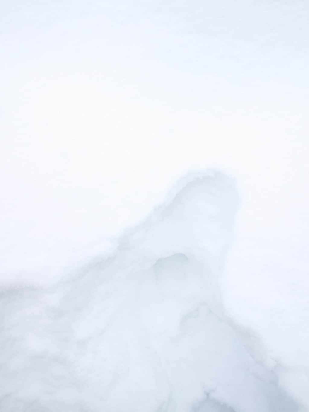
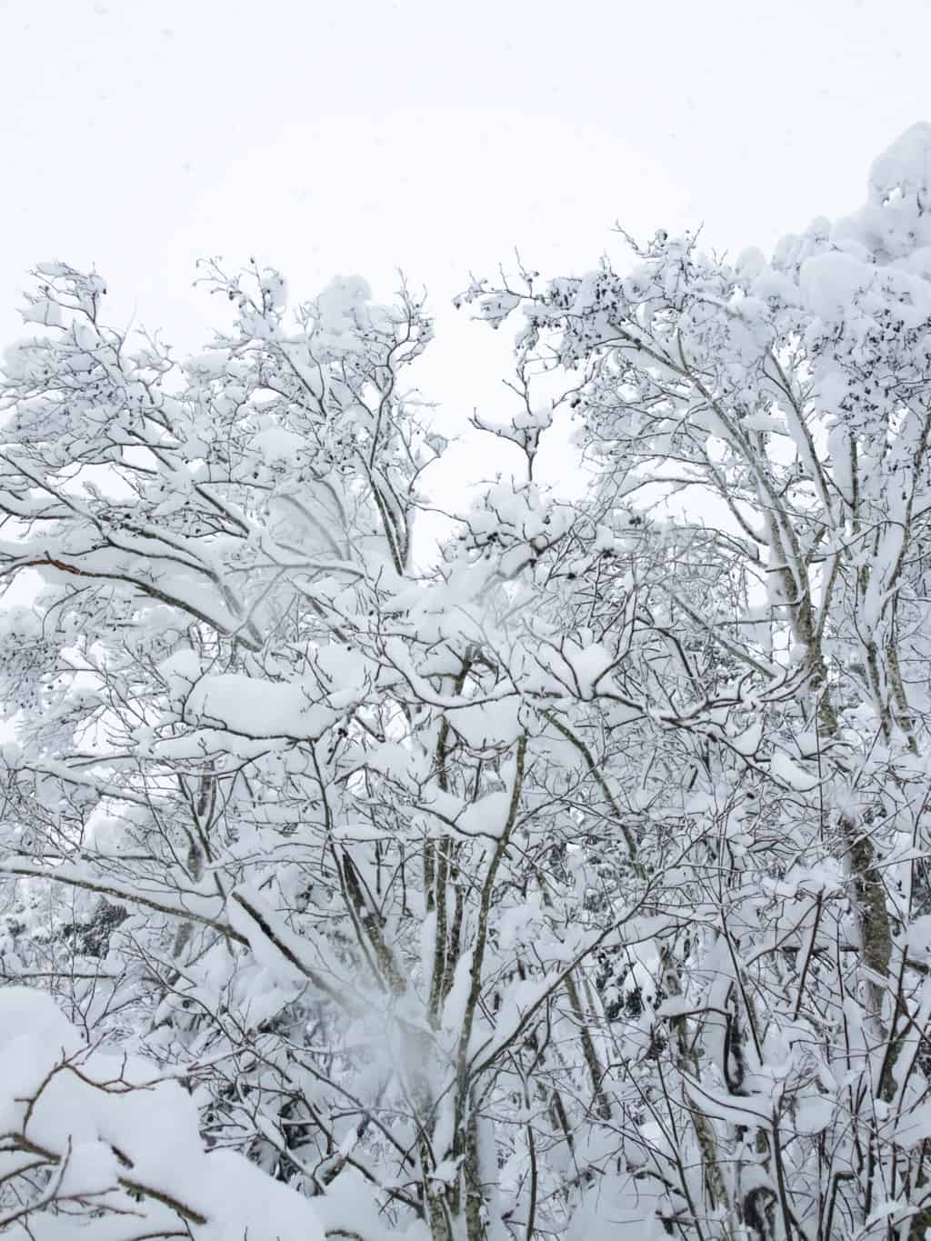
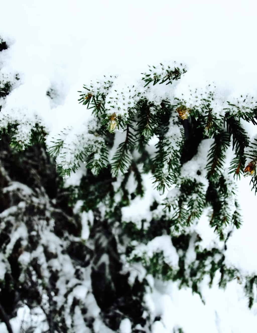
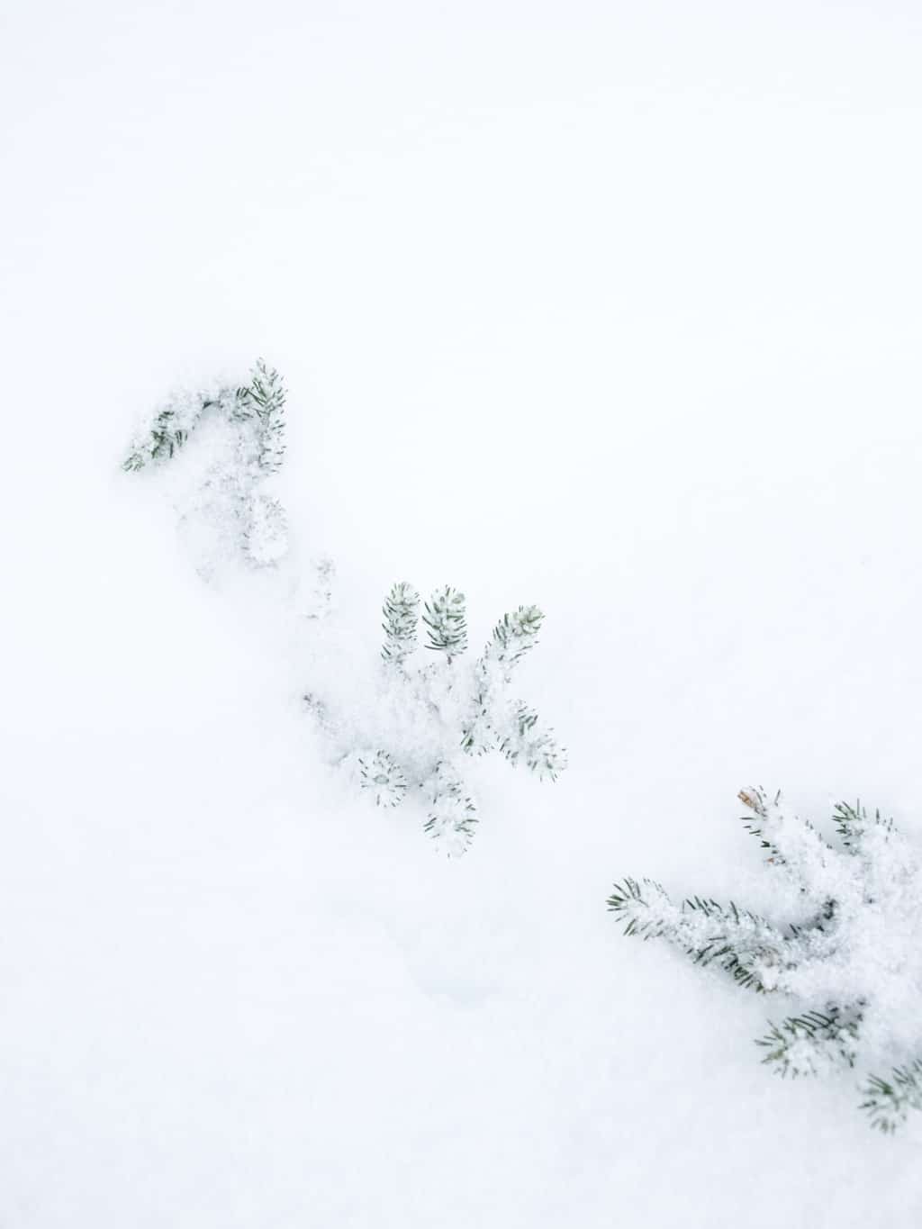
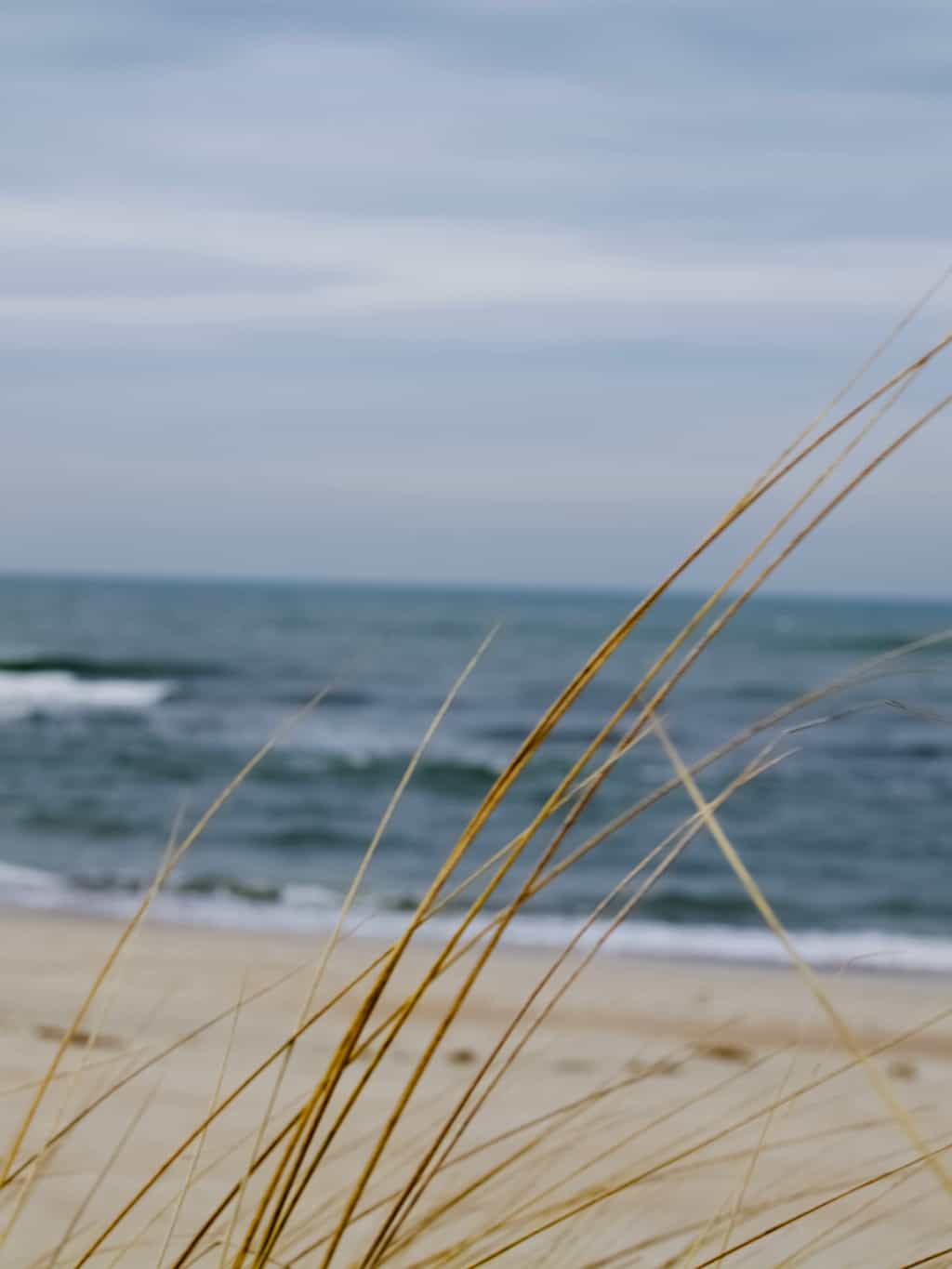
Recently I visited the Lithuanian seaside that I get constantly inspired by. I blogged about it  many times across different seasons. This time I visited when there was still a little snow left! I used the photos I took as my inspiration.Baltic sea colour palette, how to create palette using paint
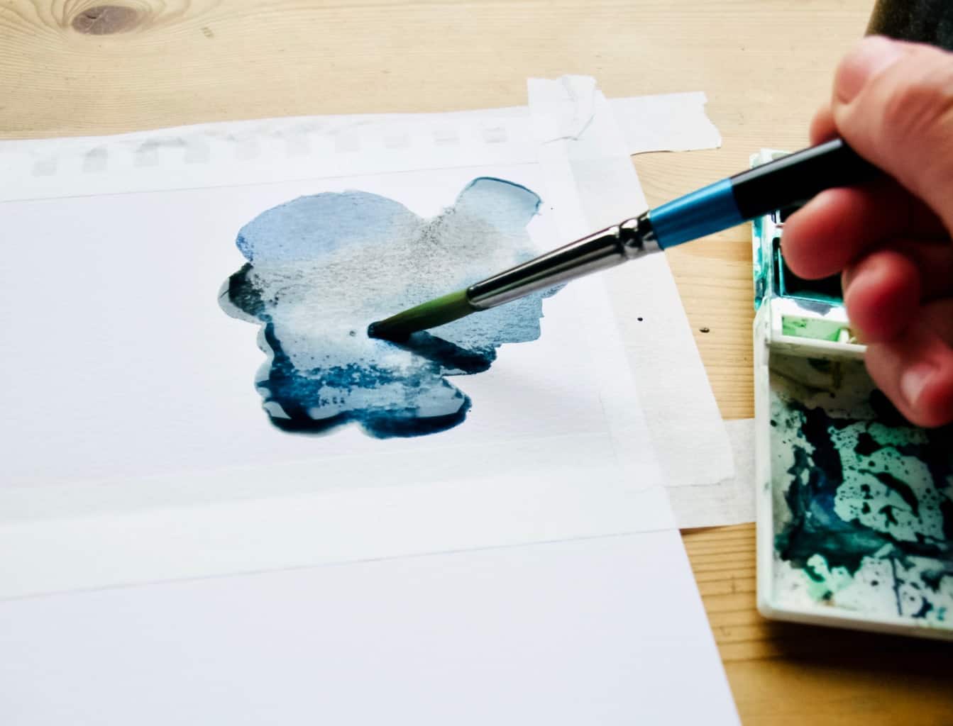
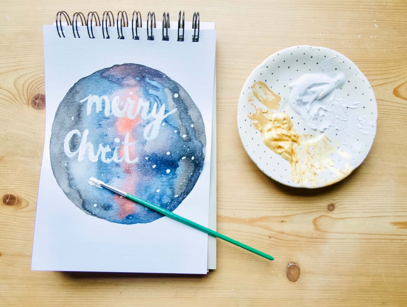
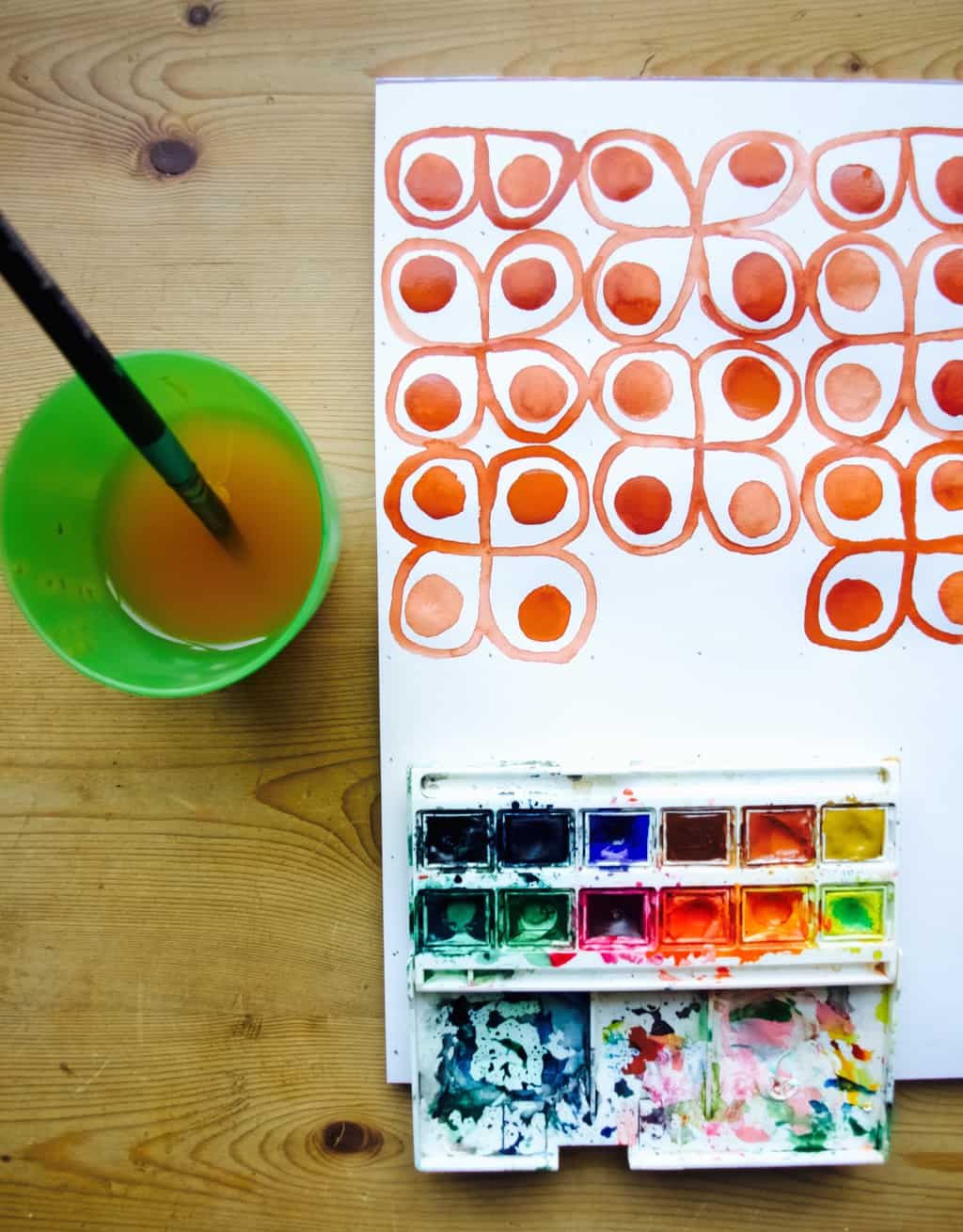
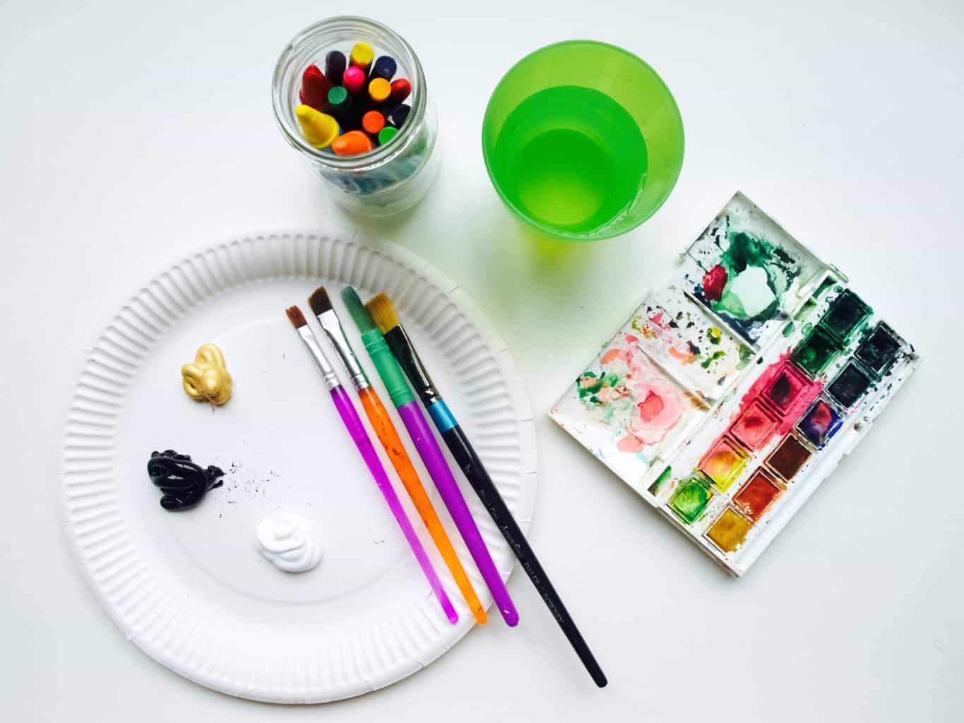
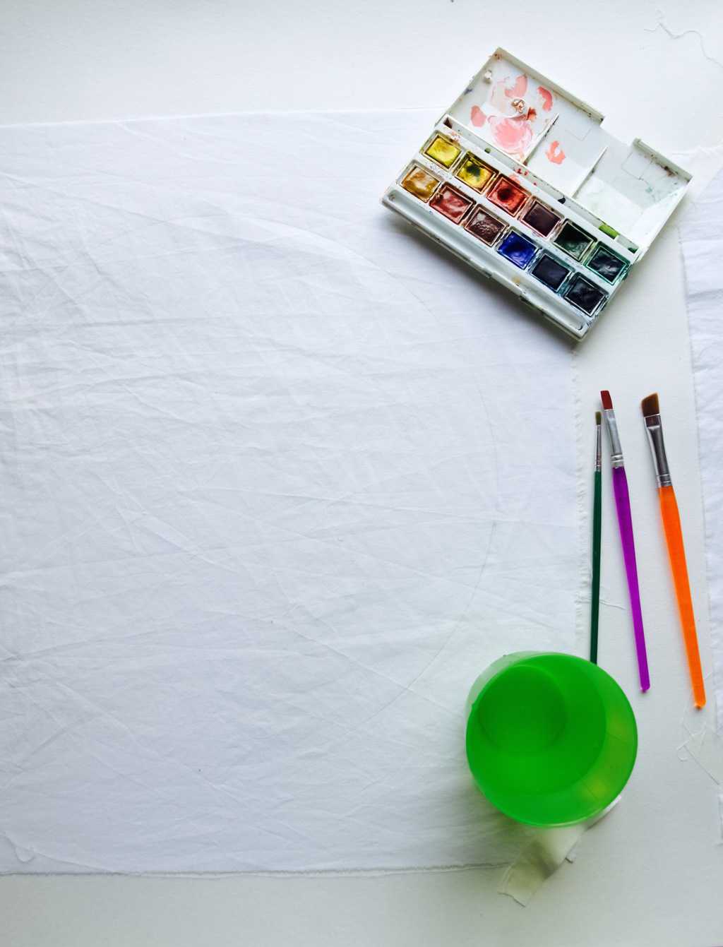
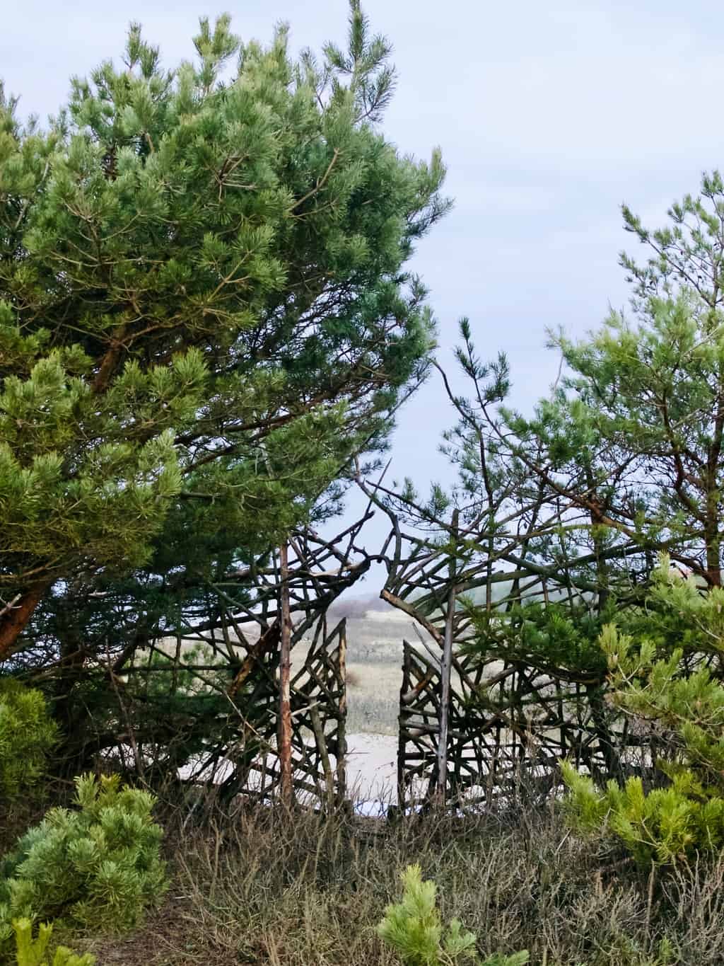
So how do I create a colour palette using paint? First step is of course to choose the paint. Any type of paint can be used for this purpose, but acrylic is probably the easiest to handle. I used a mix of acrylic paint and also some kids washable water based paint because I did not have a good selection of acrylics. It is important that you have the primary colours (yellow, green, blue and red), plus black and white. The rest of the colours can be mixed.  Baltic sea colour palette, how to create palette using paint Baltic sea colour palette, how to create palette using paint Baltic sea colour palette, how to create palette using paint
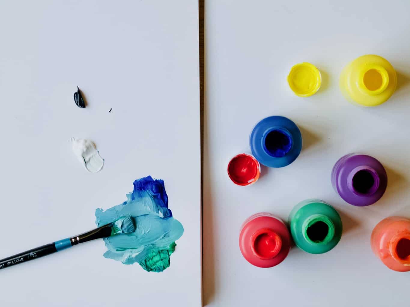
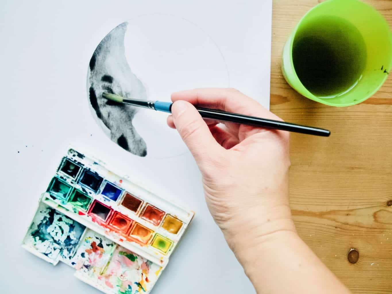
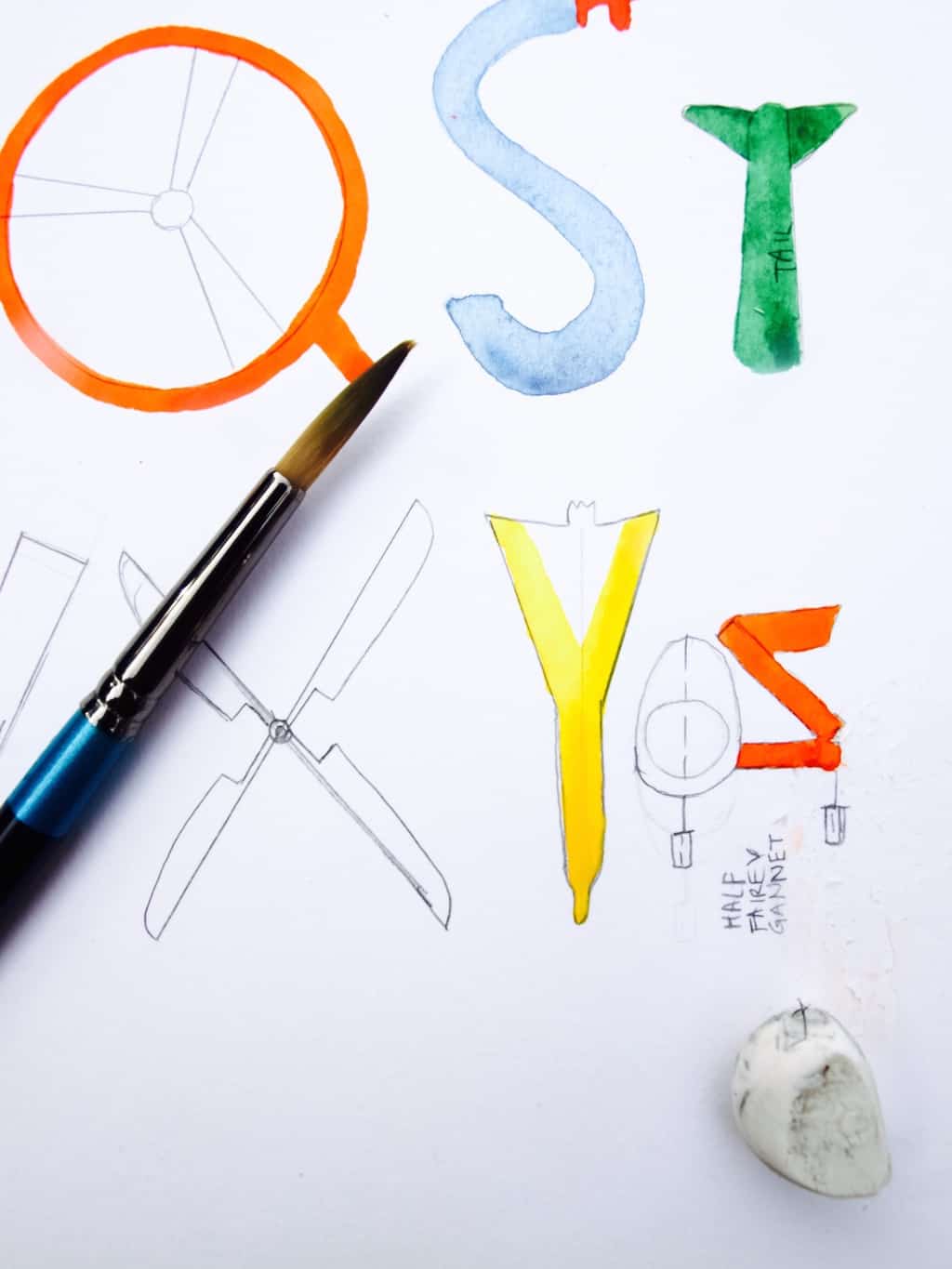
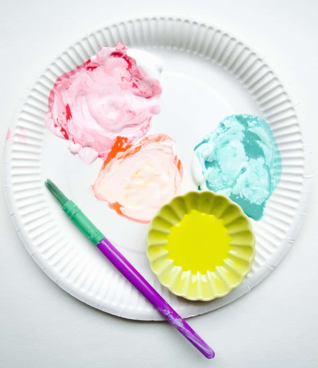
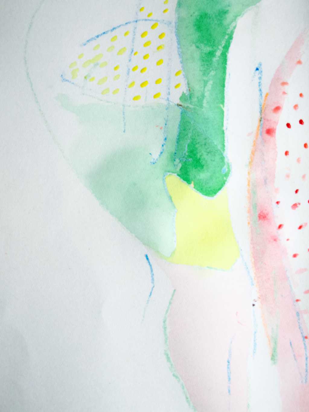
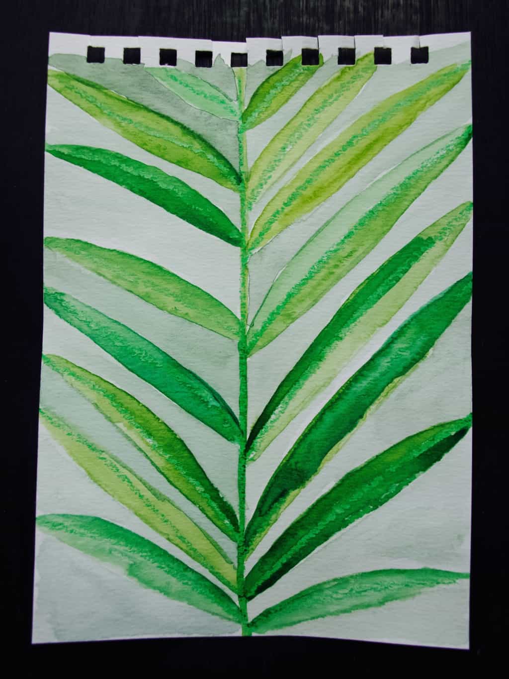
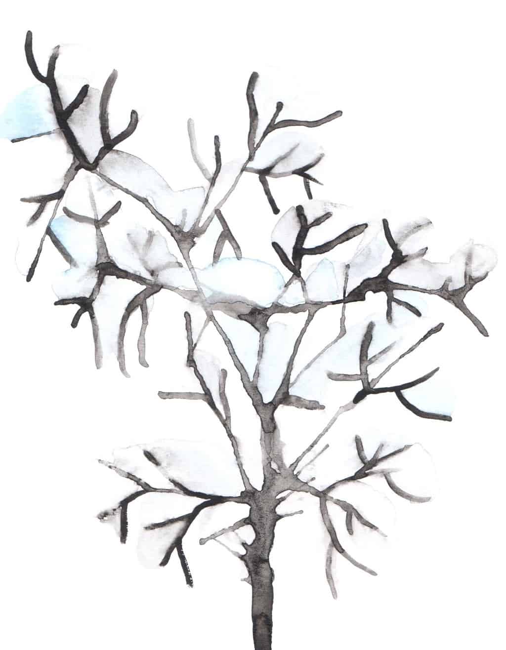
To create the colour palette you really need to have a good understanding of a colour wheel. When you understand how to achieve secondary and intermediate colours from primary colours you unlock so many other colours. Once those colours are unlocked they can be further developed by adding adding white or black to lighten or darken them. Just remember that black and white also dull the colours as well. Baltic sea colour palette, how to create palette using paint 
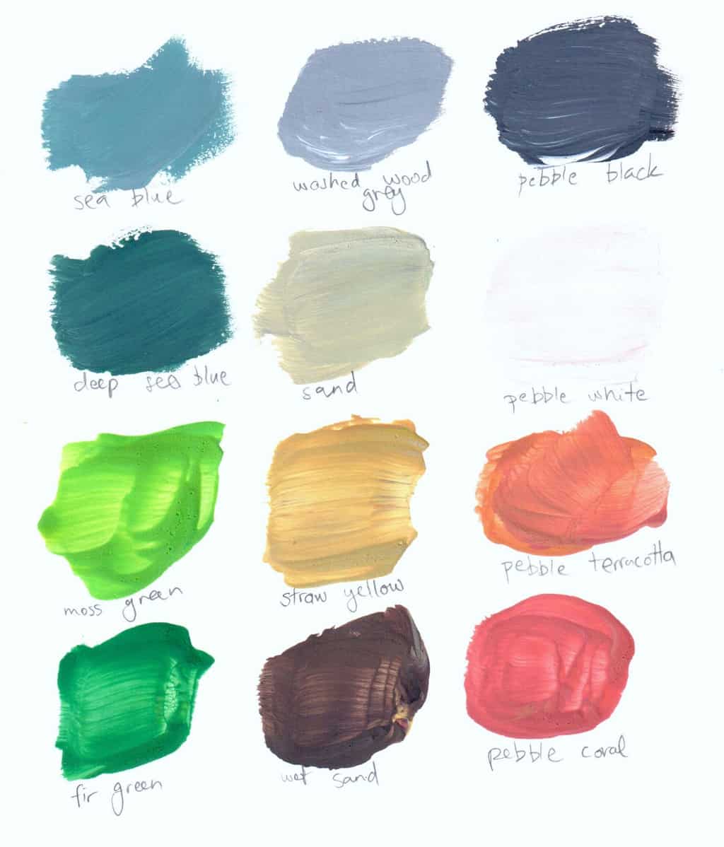
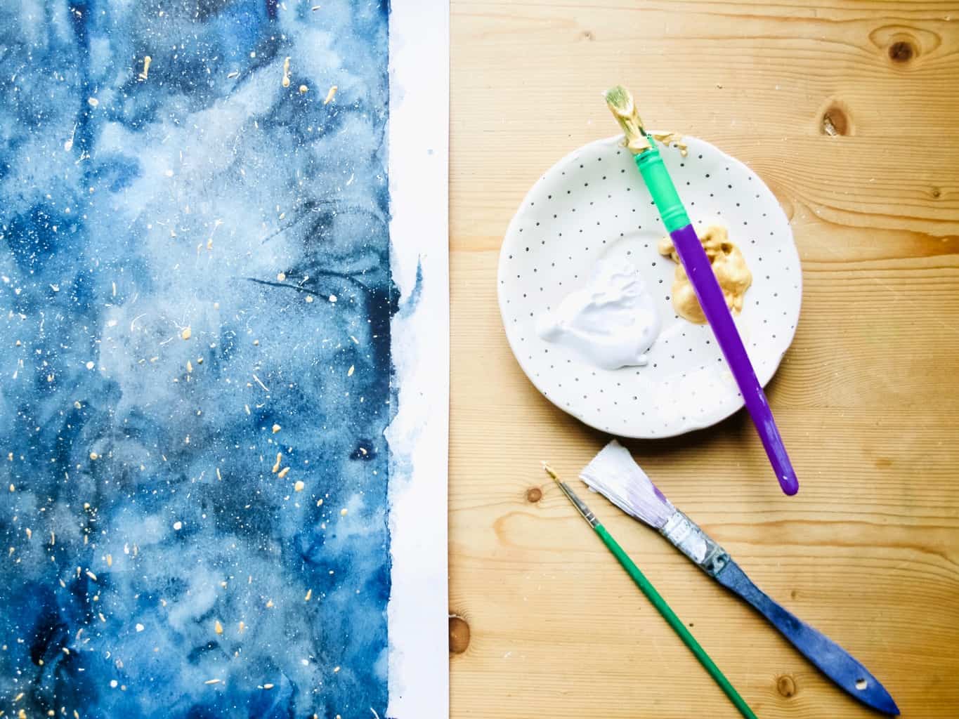
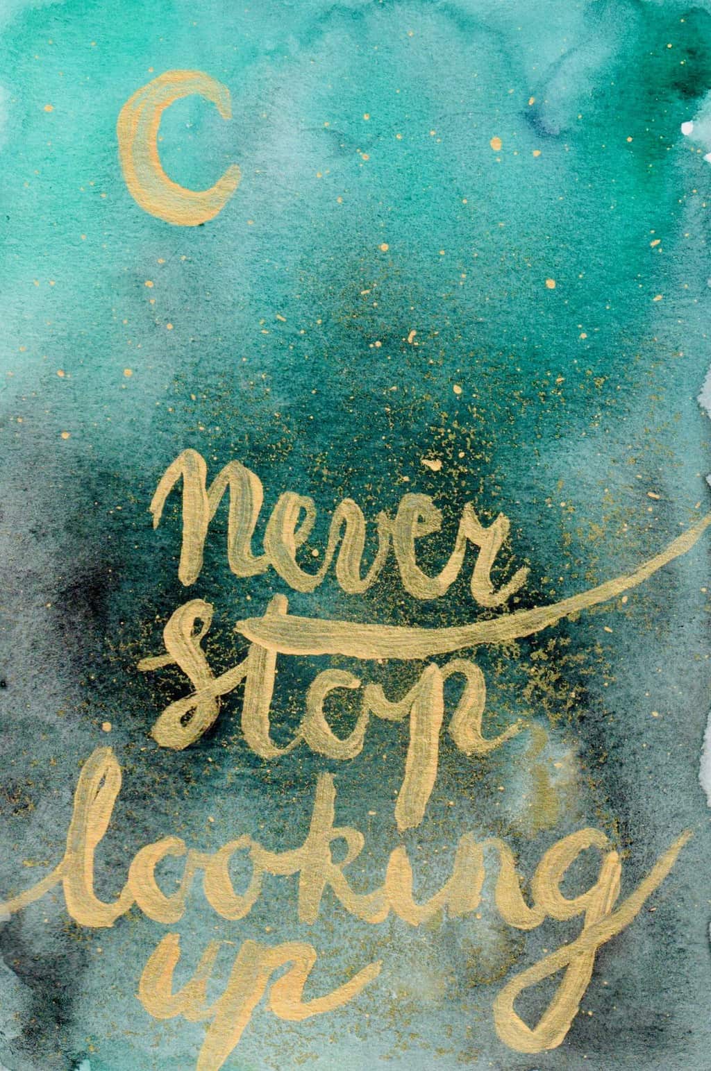
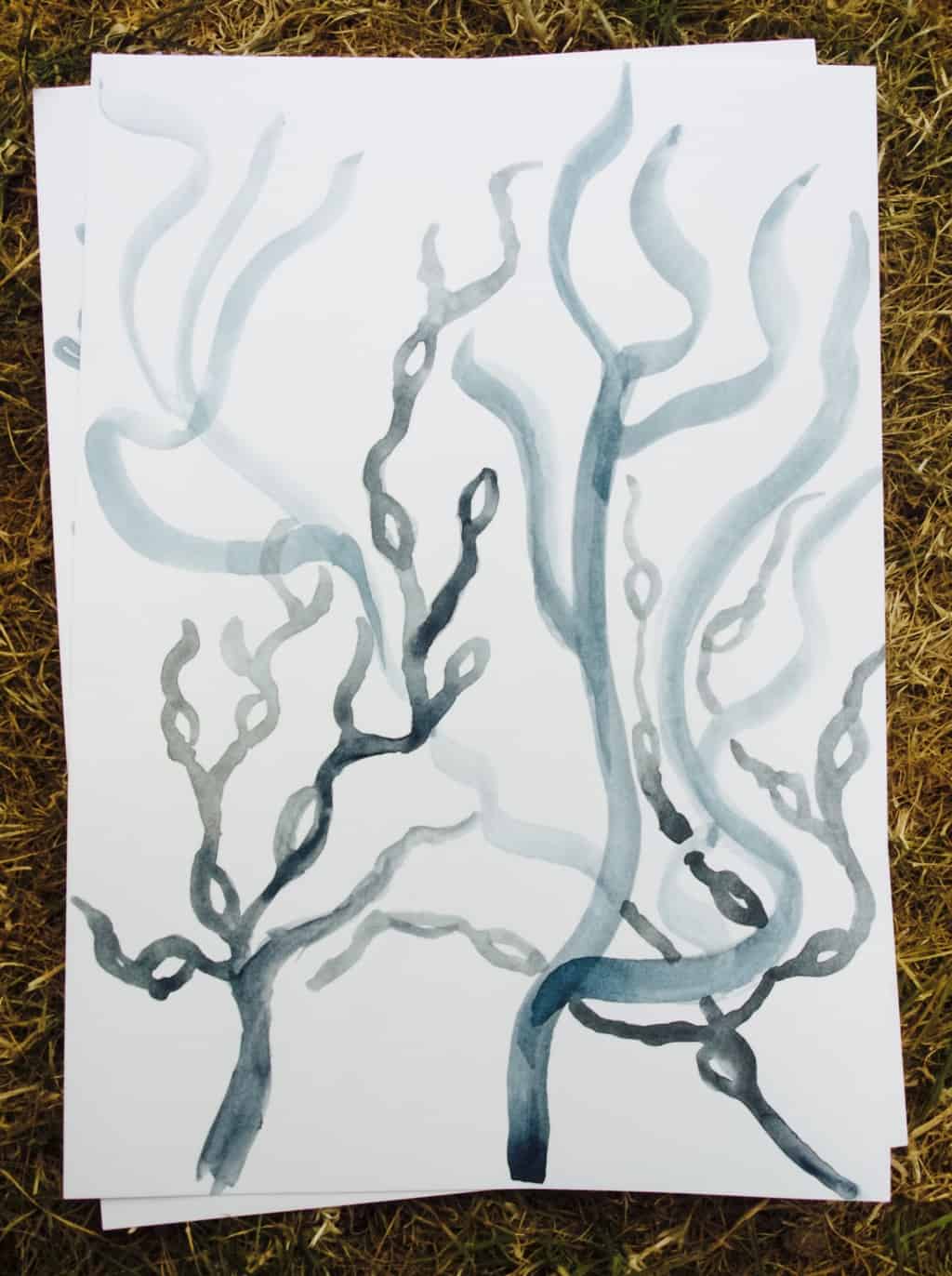
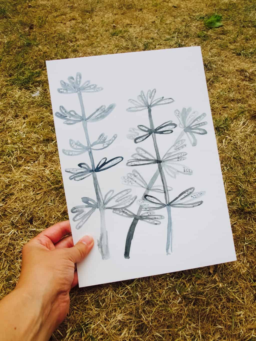
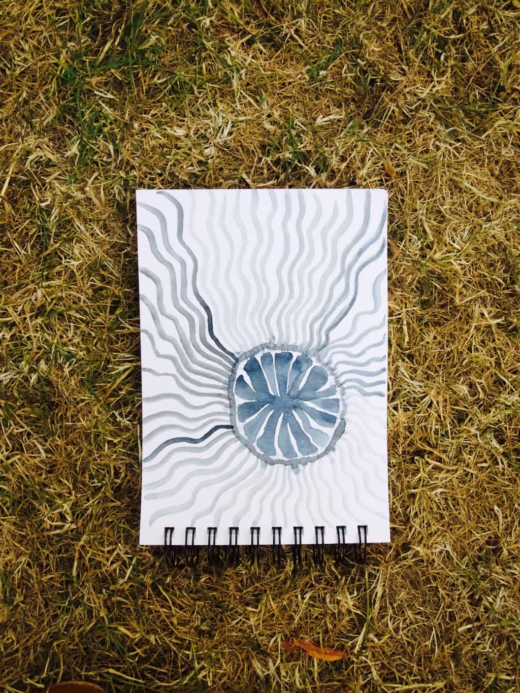
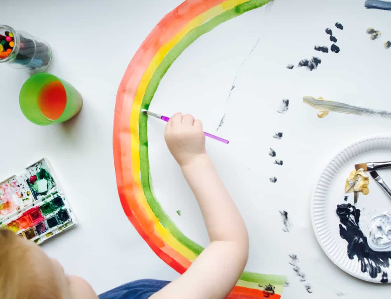
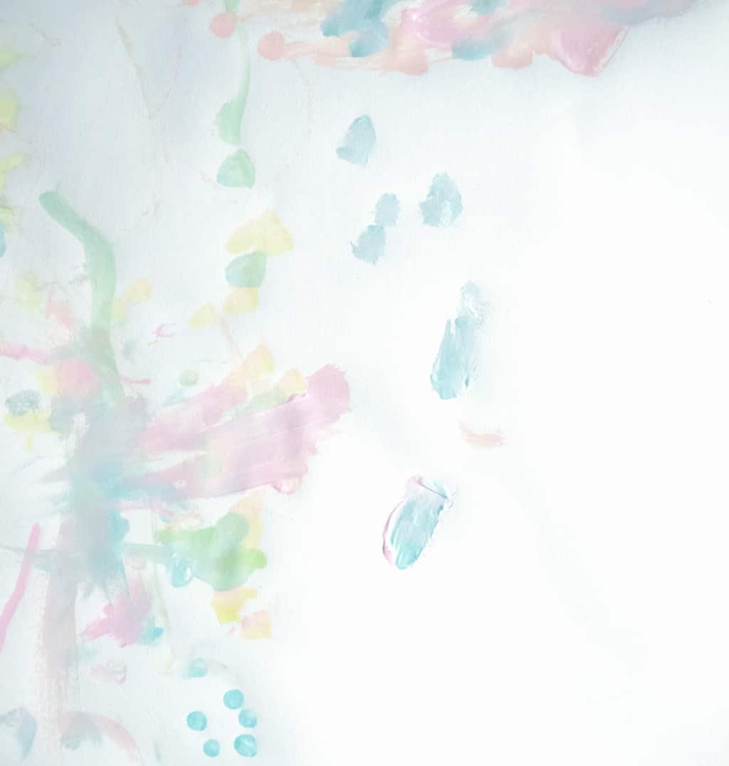
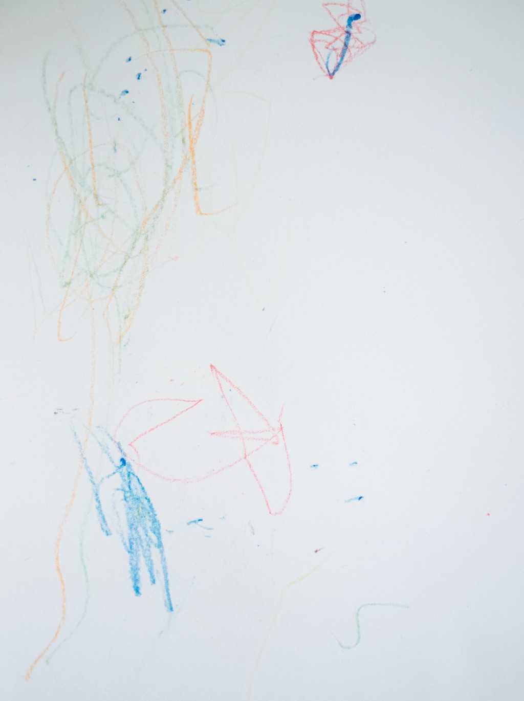
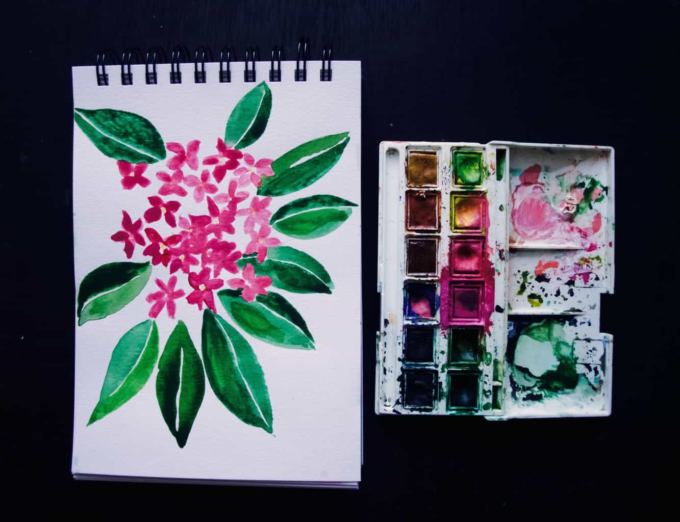
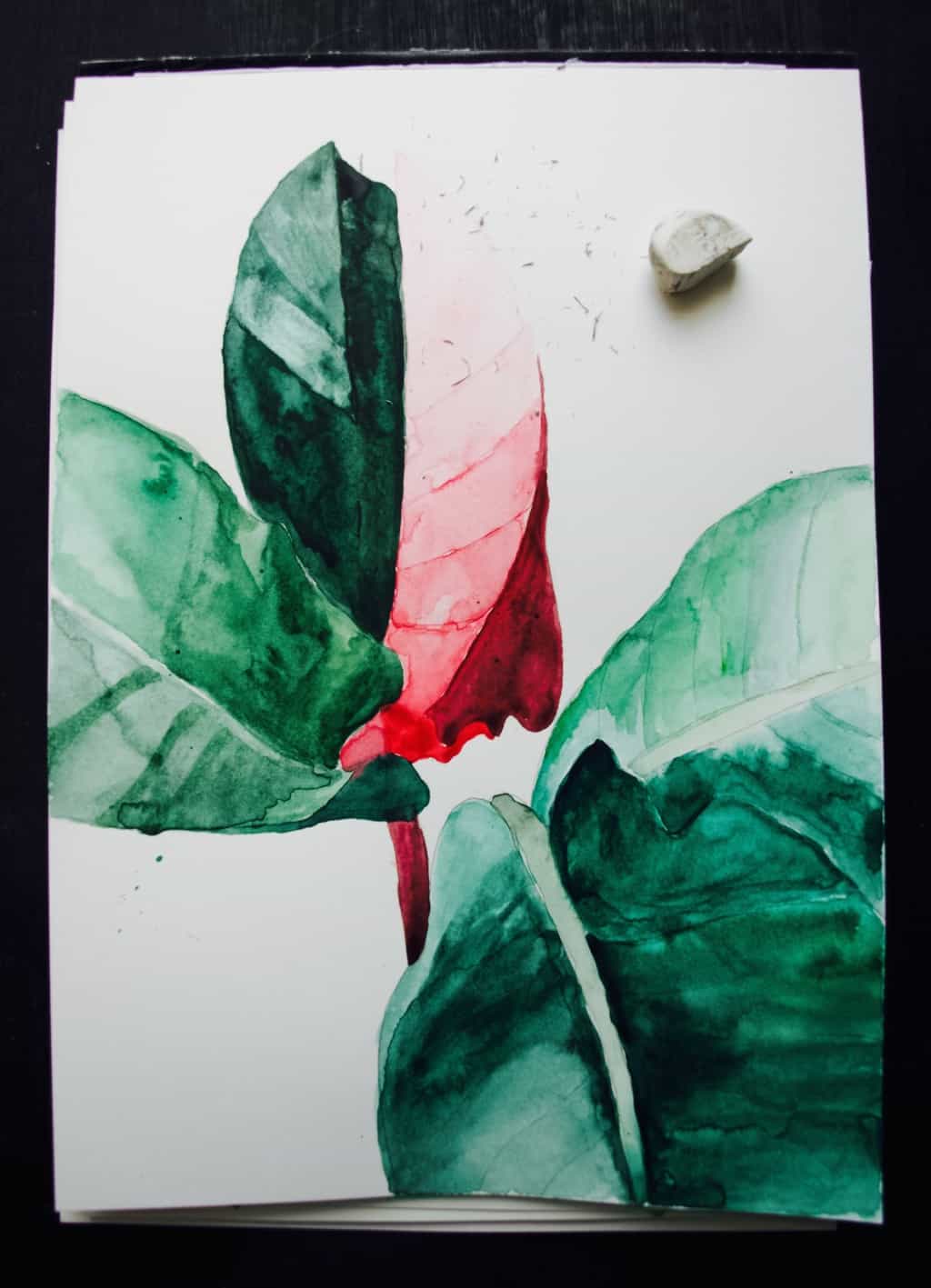
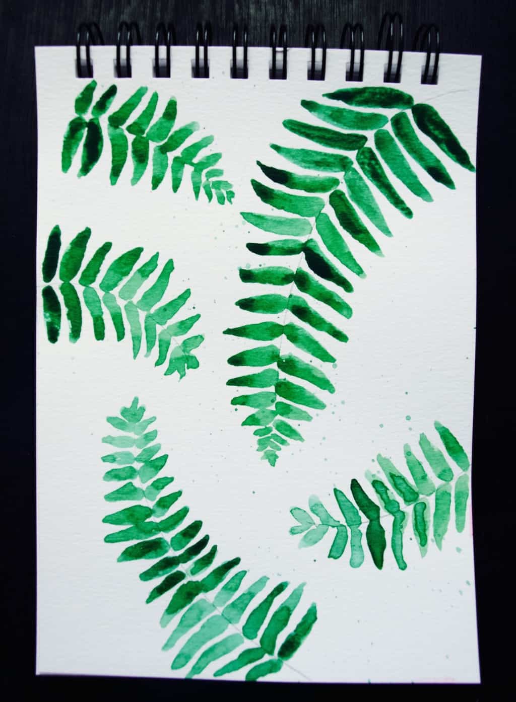
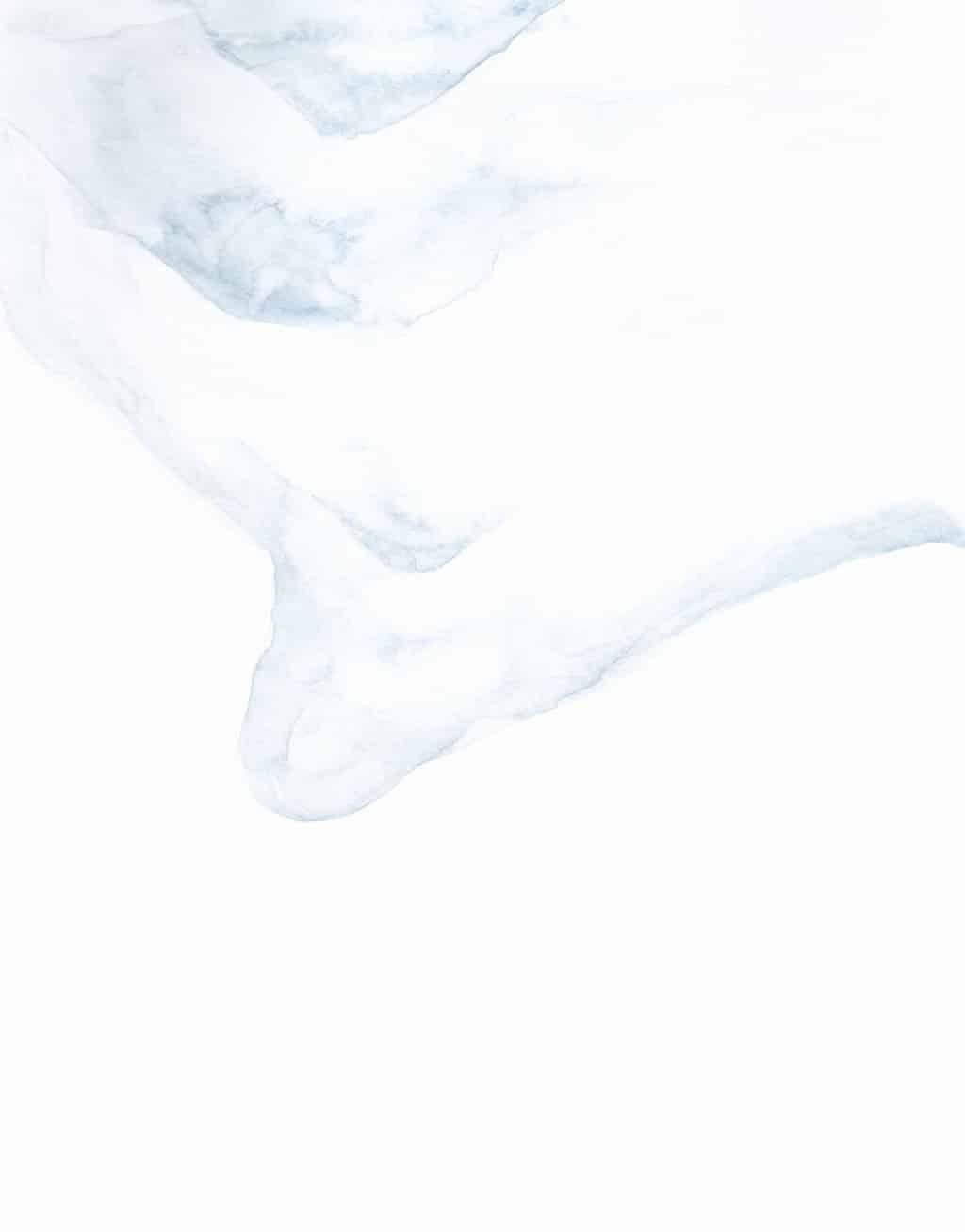
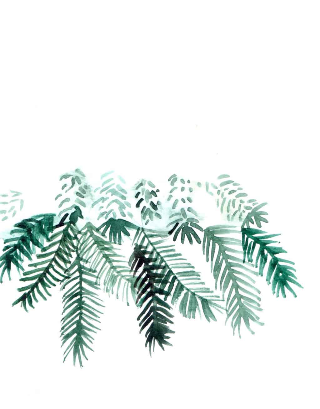
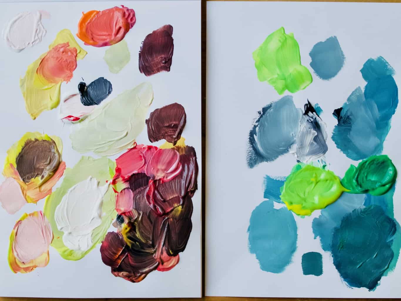
But first, before you begin creating the palette, you need to find an inspiration. You can either use photos like I did or pick an object (like a rug or patterned fabric) that has a colour combination you like. Mixing colours take practice, but it’s so fun when you get the right shade! Once I achieve the right shade I simply transfer them onto a clean piece of paper and let it dry. I particularly enjoy naming those colours, claiming ownership over them.Baltic sea colour palette, how to create palette using paint Baltic sea colour palette, how to create palette using paint Baltic sea colour palette, how to create palette using paint Baltic sea colour palette, how to create palette using paint
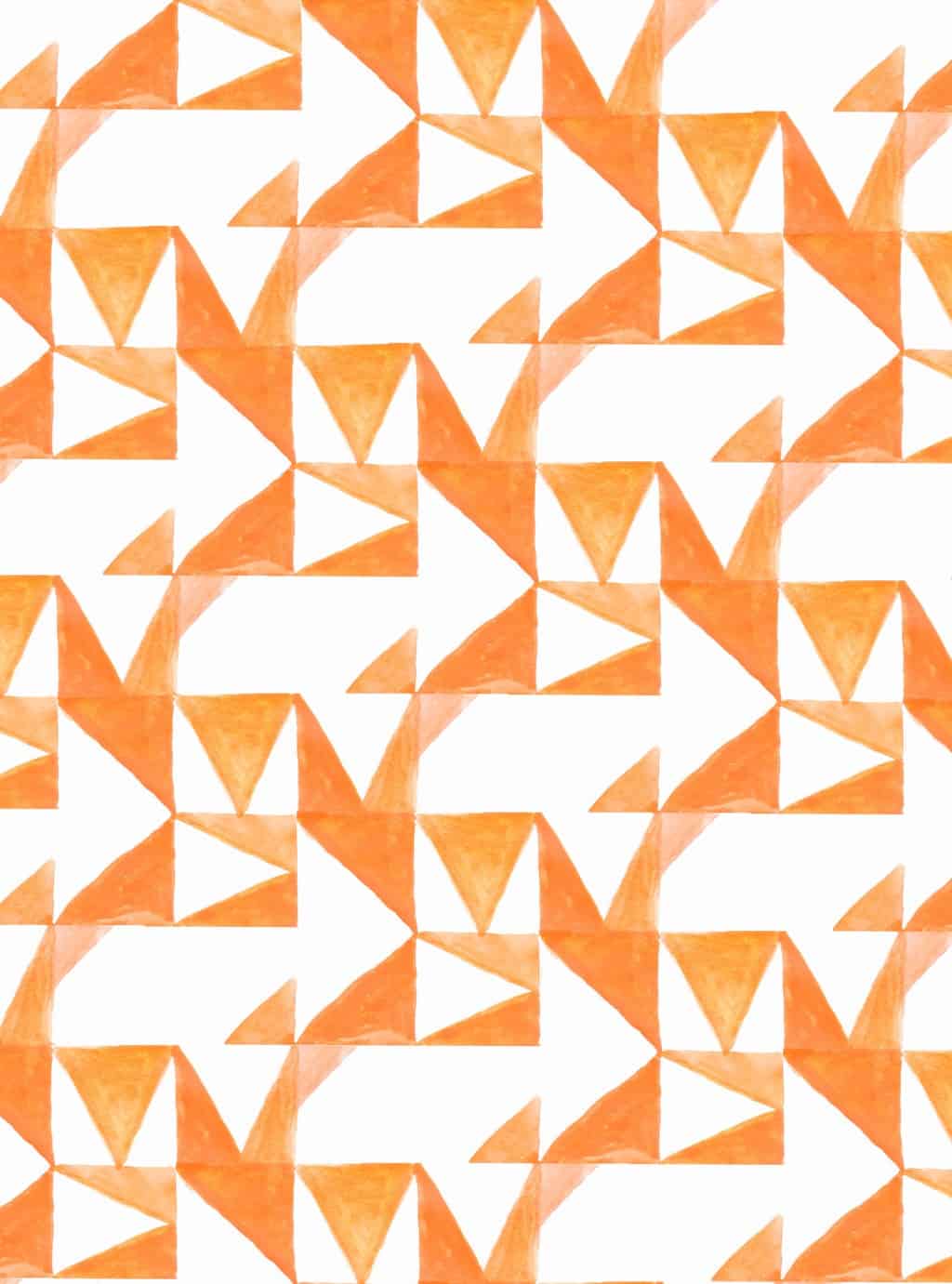
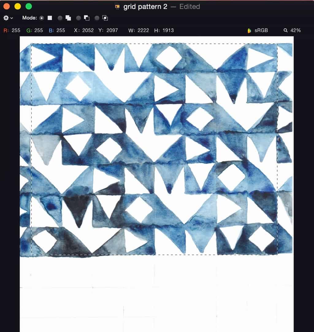
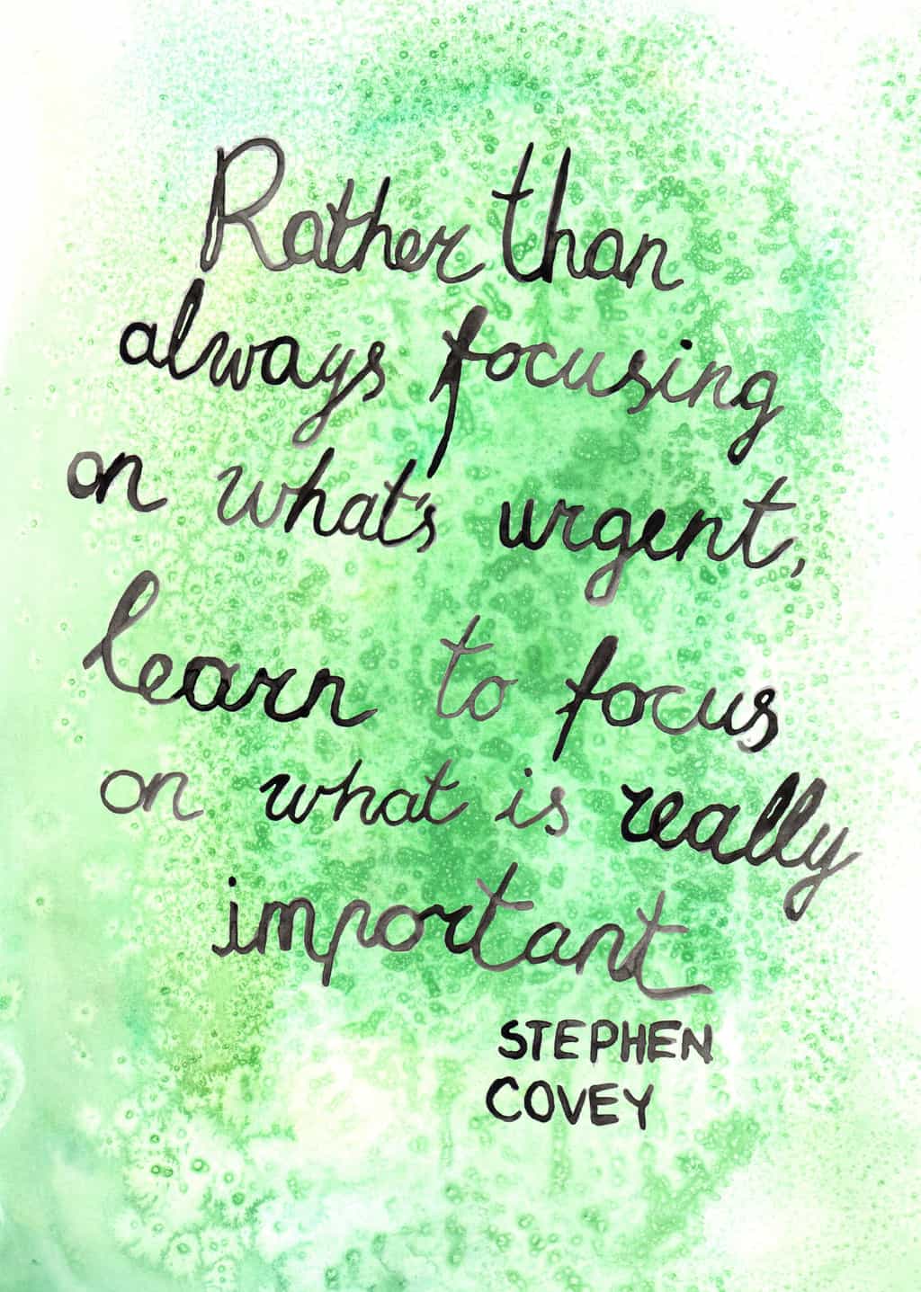
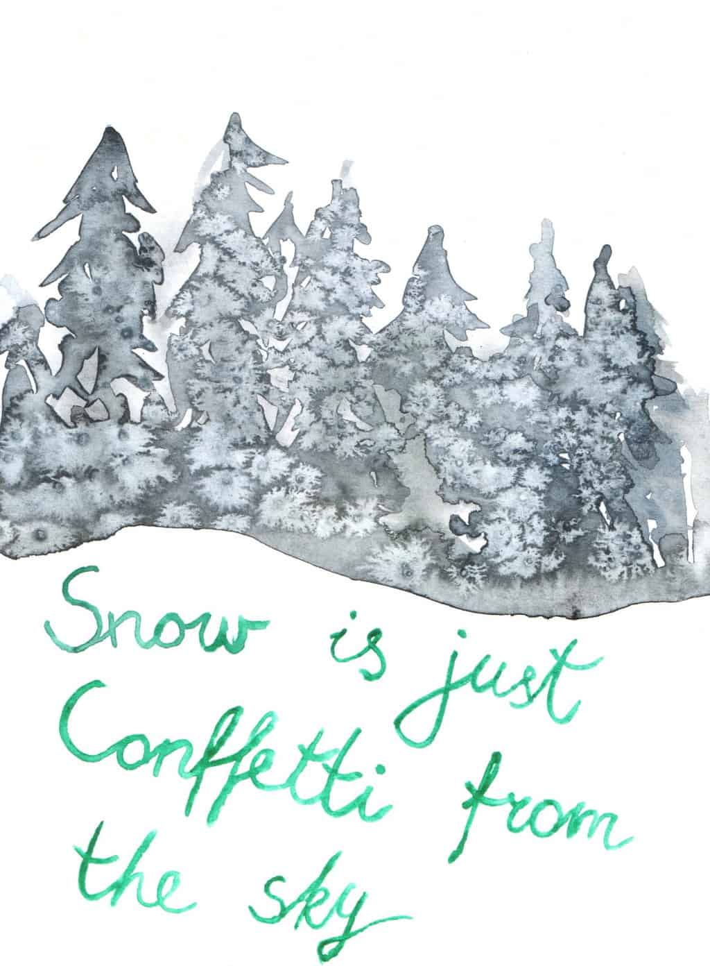
Hope you found this inspiring!

Rasa xoxo

0

How to install a gallery wall in five easy steps

How to install a gallery wall in 5 easy stepsOne of my last years goal was to fill the walls with art, and thanks to my watercolour challenge I kinda did! Except the wall space above our fireplace stayed empty for a while. I planned a wall gallery here with family pics and I have been putting this task off for a while. Why? Because I must admit making a gallery wall is challenging to me too. It’s overwhelming, so many pics to add, how to decide on frames (there are so many available!), how to arrange them. I get you! I got the same feelings too!

After doing some research and remembering what I learned in the past when doing other wall galleries at my old house I came up with a step by step plan that made arranging the frames on the wall much much easer. Creating this gallery was such an easy job after all!  Which is why I decided to share these 5 easy steps with you!

First thing I learned about creating a gallery wall is to deal with one component at the time. It soon get’s very overwhelming if you try to visualise everything in one go. My starting point is often choosing the frames maybe with one main photo installed in it. You can think what pictures to install in what frame later.

1. Create picture frame layout. When you remove one distraction is so much easer to focus on another aspect of creating gallery wall. Lay the frames you choose on the floor and keep rearranging and taking pictures of different layouts till you have at least 3 variations. Have fun!How to install a gallery wall in 5 easy steps 2. Arrange pictures/photos into the frames. After you have decided on the picture frame layout you can begin arranging pictures into it. I found using photoshop or other photo editing program to arrange the images into frame so much easer. That way you know what sizes to aim for when you do actually print it out. I used this technique when making our wedding album and that helped me to visualise the end result much better!

My Tip: Aim for balance between pictures and photos (or at least different type of photos). It looks a bit boring when all you have on the wall are pictures of people faces (as lovely as they are).How to install a gallery wall in 5 easy steps 3. Print and and frame the pictures/photos. It is that simple once you have the layout designed! This is when you can decide how much of white area you want to have around the photo in the frame. How to install a gallery wall in 5 easy steps 4. Transfer the layout onto the wall. Using cheap craft paper (in my case it was pattern cutting paper that I have loads of) trace around each frame and title each of them so you know what is what when you paste it on the wall. Cut the frame shapes out of the paper. Using sticky tape (not too strong as you don’t want to rip the wall paint off) arrange the cut-out frames onto the wall according to your original layout design.

Joni tip: Mark the centre on each cut-out frame so you know where to insert the nail/hook to hang the frame (usually in the centre). How to install a gallery wall in 5 easy steps How to install a gallery wall in 5 easy steps 5. Finally, hang the frames on the wall. And that is all! Don’t worry if the frames are slightly off the level. I think as long as it is pleasing to the eye then it’s ok.How to install a gallery wall in 5 easy steps How to install a gallery wall in 5 easy stepsHope you found this super useful!

Rasa xoxo

0

Origami advent calendar

Origami advent calendar DIYSo here it is, our advent calendar for this year :). Very very simple to make and I have already received many compliments from friends! I simply used some pattern designs that I created for watercolour challenge few months ago and it brighten up our living room already. Yey!

Each package contain origami idea which is great for me (I love learning something new!) and great with involving kids. I am planning to either teach Lukas how to make stuff by folding paper (for easy ones) or let him decorate completed origami item. I am also considering not to be stuck with using only paper. The possibilities are endless, regular blanket could turn into star for all you know. For those who are following me on social media be prepared for daily dosage of origami!Origami advent calendar DIY You ready to make your own origami advent for this year? Then let’s crack on!

You will need:

  • A4 or square size patterned paper, either printouts or shop bought gift wrapping paper
  • number tags
  • origami idea “ribbons”
  • scissors
  • treats to add into the packages (optional and we decided to go without this year)
  • a hanger
  • string or slim ribbon

First, cut out all the tags and origami idea “ribbons”.Origami advent calendar DIYMake all the packages for every 24 days. Begin with folding in corners (1.), then fold in the sides and insert all the contents (2.). Finally fold in the pointy corners once again on both sides (3) and secure it using double sided tape. Use a string or a ribbon to wrap the package like a gift (4.). Don’t forget to insert the tag before tying the knot.How to fold an envelope from A4 Once all the packages are complete, then all you need to do is tie them on the hanger and hang it on the wall.Origami advent calendar DIY Origami advent calendar DIYHappy Christmas waiting!

Rasa xoxo

0

Watercolour challenge: starry sky

Galaxy watercolour painting for card makingIt’s that time of year when the nights are long, Christmas cheer is all around us and neighbours started lighting up their fairy lights. It could not be a better time to learn how to do galaxy paintings (A must must have skill for water colour painters!). These could turn into magical magical Christmas cards, and invites, and so many other things as well as wall art.

First I began by working on my brush strokes. To achieve a deep night sky impression I moved my brush in circular movements to form cloud like patterns. It’s important to use a generous amount of water as well as layering the paint to build darker shades. To begin with I only worked with two basic colours which were black and blue.  Galaxy watercolour painting for card makingOnce the sky painting is dry, I sprinkled some “stars”. I used a heavy type of brush and using my thumb movement on it I successfully applied the micro sized stars. I then used thin paint brush to paint in bigger stars. Although majority galaxy paintings I have seen around are white, I thought it would be very cool to try gold colour acrylic paint to create some gold stars. I am totally in love with the variation!Galaxy watercolour painting for card makingOnce I mastered the galaxy painting with two colours I of course then tried including more colours. I even tried gold colour! Now, I don’t have gold watercolour paint, so I used watered down gold acrylic paint. This experiment actually worked!! The picture bellow cannot do its justice though, the painting sparkles in the real life!Galaxy watercolour painting for card makingFinally I experimented with painting into confined shape (circle). What changed are the brushstrokes. I tend to do longer brushstrokes to define the edges. The borders also meant that the painting had some sort of structure rather than ending up looking like continuous repeating pattern. Galaxy watercolour painting for card makingTip: when watercoloring with high amounts of water the paper becomes uneven and wrinkly. The best way to make the paper flat again is to iron it. Cover the painting with baking paper and iron it with steam free setting. I find this is safe even with the high temperature setting.Galaxy watercolour painting for card makingWhen the time came to make the Christmas cards I decided to experiment with foiling (I am so in love with gold right now!). Sadly this did not work out. I am sure it’s all my fault! This foil I bought meant to be used with the foiling machine, but someone suggested this could be used with iron. At the end the foil melted instead sticking onto paper. I even used PVA after unsuccessful application using toner pen. Nothing worked! I decided to leave foiling for later, I am sure I will figure this out some other time. Galaxy watercolour painting for card making I ended up using gold paint to paint the letters which was acceptable, but not ideal (hope my neighbours like it).Galaxy watercolour painting for card making White acrylic paint works fine too. If only I did not misspelled “Christmas” over here!Galaxy watercolour painting for card makingHope you found this helpful! Are you making your cards yourself this year?

Rasa xoxo

0

Watercolour challenge: repeating patterns

Repeating patterns with watercolour This month I am doing something very exciting for my watercolour challenge. Yes, it’s patterns, my favourite art form! However it would be not very challenging if I did something I am good at already?! This is why I decided to perfect my skill of repeating patterns with some new methods.

When I used to create repeating patterns before it was mostly by drawing/painting/arranging different items/details in repeating order. But as you may all know this is not an accurate way to create repeating patterns. The objects I draw can differ in size as it is literally impossible to exactly replicate the same item/detail every time.

Alternatively I used to take a square of the drawing or paining and repeat it on the photoshop (or any other editing software), but this created very boring, common patterns. I always wondered how do you make repeating patterns that are seamless.

I was little inspired by this YouTube and other few videos on how to create drawn repeating patterns. This method is all about cutting a square shaped picture into four blocks and then swapping them around so the edges of the picture end up at the centre so you can draw on the seams to make it look like that those seams were never there (you really need to watch that video to really understand it). However, this method would not work with watercolour. As you can imagine, watercolour would probably leak at the cut edges.

This is when I came up with the idea to create repeating pattern using a grid. Although this is not a perfect way to create a repeating pattern, I realise the grid gives a good guideline. I started this by painting 7 different design blocks that flows into each other(tesselates) and creates a reasonably repeating pattern.    Repeating patterns with watercolour  This could then be coped and pasted on any editing software.Repeating patterns with watercolour Pattern seem to be more accurate when created on the computer, however it still has that hand painted look because of its origins.Repeating patterns with watercolour I created another pattern in a similar way, except this time round I painted enough of those 7 blocks in a row that created one huge block which was repeating itself naturally. This way all I needed to do is copy and paste this block few times.Repeating patterns with watercolour Repeating patterns with watercolour  Next I wanted to break away from the grid without actually leaving it. I painted leaves in repeating order. The grid allowed me to keep the leaves in similar shape and line. So when I repeated it on a computer this pattern repeated itself flawlessly. Repeating patterns with watercolour I tried the same technique on another design and this time round I realised the problem of the grid itself. The grid would not erase after it has been painted over. And with the light colour you can see the grid very clearly. I had to use the clone tool to hide those annoying lines that was never meant to be part of the pattern.Repeating patterns with watercolour After repeating the pattern the same way as the others I realised it does not match very easily with plain painted areas (it’s very difficult to get the same shade of colour every time). This also had to be corrected with the clone tool.Repeating patterns with watercolour Repeating patterns with watercolour  Finally instead of a grid I used a dot system. It guides you like a grid, but its not as visible in case you can’t erase it. Repeating patterns with watercolour As you can see, this creates almost perfect repeating patterns ;-).Repeating patterns with watercolourHope you are inspired

Rasa xoxo

1

Watercolour challenge: brush lettering

Watercolour brush letteringLast month I was reviewing my yearly goals and I realised that I was nowhere close to learning calligraphy. This is when I decided that I needed to focus on hand lettering, hence watercolour brush lettering! I also used bible verses for this project so that way I could meditate on the word as well as learning new skill.

I started with the basic handwriting style that I once learned from my friend Vicki. It was the type of handwriting style that you learn in old school where you draw all of your letters connected and within the lines (remember?). Except this hand lettering style does not require lines. It flows out freestyle!

I soon got bored with that writing style and was ready to add more character to my hand lettering.

This is when I came across brush lettering. Brush lettering is a style of writing similar to calligraphy, but done with brush pens. When doing brush lettering the key thing to remember is the pen pressure and the stroke thickness:

  • Heavy pressure is applied in a downward motion to create thick stroke
  • Light pressure is applied in an upward motion to create thin stroke

Watercolour brush lettering Although I was painting letters with an actual brush, it was not easy to control the strokes. At some places I needed to thicken the lines manually instead of applying pressure as I paint.Watercolour brush lettering Initially I tried a round brush but then switched to a flat shaped brush that made neat thick lines. However I found it difficult to paint thin lines with it. The only way to paint thin lines with this brush was to paint sideways. I quickly ditched that and went back to a round shaped brush.Watercolour brush lettering Watercolour brush lettering With the round brush back in hand I soon got got the hang of brush lettering. You know what they say, practice makes perfect ;-). I experimented with different types of font such as printed, joined or separated hand lettering. I even tried to format my hand writing. I drew lines with the pencil to mark the guidelines. Watercolour brush lettering Once I learned to format the lettering I had a go with the bounce hand writing font. This was so so much fun. Bounce hand lettering is all about drawing letters outside their guidelines: one letter down, the second letter up and third letter down again (I hope you get the point). Essentially the letters bounce ;-)Watercolour brush lettering Watercolour brush letteringI loved loved loved learning watercolour calligraphy, hope you will too ;-)

Rasa xoxo

0

Watercolour challenge: underwater

Watercolour challenge: underwater paintings inspired my mural walls in FranceLast month while exploring Carhaix-Plougue in France I was surprised to see so many creative wall murals around. These were mostly underwater creatures and seaweed that were appearing not only on the walls. There were few similar artworks displayed on the windows too. Watercolour challenge: underwater paintings inspired my mural walls in France Watercolour challenge: underwater paintings inspired my mural walls in France Watercolour challenge: underwater paintings inspired my mural walls in FranceSo inspired by all this art I decided to paint similar art for my watercolour challenge. It has been refreshing to paint something in one colour and discover different tones in it. I chose bluish grey which was perfect for sea world paintings.Watercolour challenge: underwater paintings inspired my mural walls in France Watercolour challenge: underwater paintings inspired my mural walls in FranceLater I realised that the wall murals in France were actually just the paintings on white paper and then stuck onto the wall. I wonder if they were having an open-air art gallery out there in Carhaix-Plougue…. hmmWatercolour challenge: underwater paintings inspired my mural walls in France Watercolour challenge: underwater paintings inspired my mural walls in FranceWe found this jelly fish at the beach which is soo pretty and obviously made its way to my pages on my notebook. I think sometimes the best inspiration comes from nature itself ;-).Watercolour challenge: underwater paintings inspired my mural walls in France Watercolour challenge: underwater paintings inspired my mural walls in FranceThanks for letting me share!

Rasa xoxo

0

Watercolour challenge: planes and letters

Watercolour challenge: planes and lettersSooo, we are still on the mission to fill the walls in the kids room with pictures and Lukas is involved in this project as always (even if I don’t ask him to).

This months watercolour challenge theme is planes! Obviously because Lukas loves planes! This boy builds the planes out of lego, pretends to be flying like a plane and flies every possible object like a plane. You got the picture! I felt I had to make the boys room plane themed.

I have been imagining to paint those pretty biplanes and then an alphabet to go along with it. However (as always) things did not go to my plan. Although at least I have one artwork on the wall now!! Watercolour challenge: planes and letters Watercolour challenge: planes and lettersI started this month’s watercolour challenge with painting biplanes. It needed lots of attention to detail and lots of pencil work with rulers. The watercolour part only took few minutes. I did not like the end result too much. I can’t even explain why, definitely did not look what I had in my vision.Watercolour challenge: planes and lettersNext I started on the alphabet and I guess because painting biplanes did not work that much I looked at other planes to inspire me too. It was real fun to look through Joni’s plane books to find some planes that actually start with the letter I wanted to use it for. For instance I used the Avro Arrow aircraft to represent letter “A”.Watercolour challenge: planes and letters Watercolour challenge: planes and lettersI made plenty of mistakes, the letter “Z” is the wrong way round and plenty of mess that I could not quite rub off with the eraser. However I do love this artwork and it is hanging in the boys bedroom till one day I will decide to redo it.Watercolour challenge: planes and lettersSince I had so much fun painting different aircrafts from Joni’s book, I tried drawing one with propellers. Was not too pleased with this painting so decided to end painting here.Watercolour challenge: planes and letters Watercolour challenge: planes and lettersFor now I am just so pleased with the plane inspired alphabet.

What’s your favourite painting?

Rasa xoxo

0

Make your own macrame inspired crochet wall art

Do you remember when I made watercolour and embroidery wall art? I did say I was not 100% sure if it went with our bedroom interior and I think I was right (although there is no right and wrong when it comes to deco they say). This artwork never grew on me and it was time to replace it to something else completely different.

Now I am currently loving macrame craft although I am clueless how it’s done. When you are too busy with other projects I think sometimes its best to use the skills you already have. In my case this means crochet. Don’t you think crochet looks visually similar to macrame? I think when it is done the right way it can look pretty close!

Few months ago I made the climbing plant trellis inspired by macrame. I loved the outcome (and some yarn left) so I decided to repeat the technique somewhere else (although it happened to be in the same room). What do you think?Make your own macrame inspired crochet wall art If you are loving this as much as I do then you can access the project here.Make your own macrame inspired crochet wall artThanks for letting me share my macrame love ;-)

Rasa xoxo

0

Watercolour challenge: toddler doodles

Toddler doodles turned into abstract artSo this month for my watercolour challenge I decided to collaborate with my own 2 year old toddler (Eek!!). I enjoyed watching Lukas do art so much that I thought it would be very cool to create some careless abstract art inspired by his doodles and fill our kids room walls with it. Isn’t that the greatest idea you ever heard? Well, not quite! Although it did not work out exactly how I imagined (no artwork on the walls yet), working with the toddler thought me one thing or two. Before I tell you all about it, shall I explain how we did go about it first? If you agree then read on to hear my full story below. For our first arty session I set out with all material I had in stock. Although I don’t have crazy amount of art material, it was still little too much. This was my first lesson on how to make art with the toddler. Never give too much choice or you will be overwhelmed or (what happened in our case) he will be obsessed with one art media. I started by painting large rainbow on the page and Lukas joined in as soon as he noticed me painting. He picked a brush and kept dipping it where ever he could find: acrylics and water paint. The result was as I was expecting although I am not sure about the colour combo here, it did not go with our house interior at all.  Because I noticed Lukas likes to spread a paint with the brush, I realised watercolour was too watery. This is why I mixed up few watercolours with white acrylic paint to get thicker paint. But that meant the colours ended up very pastel. If you like pastel colours than this is fine, but I was not a big fan of this as I LOOOOOVVEEE bold colours.Toddler doodles turned into abstract art Toddler doodles turned into abstract artBut why I did not like Lukas using water colour straight? Well… a 2 year old did not quite understand the concept of using it. To use watercolour you need to constantly dip your brush into water between colour change and before to moisten the paint as well. To fix this problem I tried to dilute some watercolour pigment in little water. Here it is, I made a palette that I though would work.  Toddler doodles turned into abstract artExcept, yellow soon got mixed with green, created lime colour and other colours got mixed up as well. Did I tell you how easily watercolour mixes? You get the image: lots of grey/brown paintings. The pic below was the least overdone (lol).

I also tried placing few drops of watercolour ready on paper. You can blow on those drops to create pretty lines and patterns (this is my fave painting technique!!!). However this did not work out with 2 year old, he just did not quite get what exactly I wanted him to do with the straw I gave him (although I gave him plenty of demonstrations). Toddler doodles turned into abstract art Eventually I let him scribble away with crayons. Toddler doodles turned into abstract art I used Lukas scribbles to make my own abstract art which I much preferred. However I realised that this does not go with our house or my style. Toddler doodles turned into abstract artThe artwork with alphabet is my fav, however it does not have so much input from Lukas. I am thinking maybe for my next watercolour challenge I should do something alphabet themed (I really really enjoyed painting letters). Will see ;-).Toddler doodles turned into abstract artHope you have been inspired ;-)

Rasa xoxo

0

Kids art Easter biscuits

Kids art Easter cookies diyHands up who is really really looking forward to Easter! We do! Me and kids are in Devon with the grandparents already and we are pretty much ready here (its easy when you are not hosting).

Me and Lukas has been drawing and painting lots recently so I initially thought we will do good old Lithuanian tradition and paint some eggs, but then I decided against it when I thought of shortbread biscuits… hmmm! I thought if I make the biscuits into egg shape then it will be like painting eggs but on the flat surface rather than the round surface (a little less messy I thought). Plus, I thought this is a very good opportunity to try out more of natural food colouring :-).Kids art Easter cookies DIYKIDS ART EASTER BISCUITS

(for biscuits)

  • 240g butter, softened
  • 200g sugar
  • 1 egg
  • 500g flour
  • 1tsp baking powder
  • 4tbsp milk

(for the “paint”)

  • 4tbsp icing sugar, sifted
  • water
  • 1tsp beetroot powder for pink
  • 1/2tsp turmeric powder for yellow
  • 1tsp matcha powder for green

1. Place all the biscuits ingredients into the mixer and switch it on for few min till everything turns into nice soft dough. At this point you can wrap the dough and place it in the fridge for the next day or freezer for whenever you need it in the future.

2. Flour the surface and the rolling pin and roll the dough about 7 mm thick. Using biscuit cutter or a cup/glass cut the circles in the dough. Once the circles are out of the dough roll it once more again (only one way) to make an oval shape.

Kids art Easter biscuits DIY 3. You can involve your kid at this point. Lukas was treating the dough as he would the play-dough.

4. Place all the dough shapes into lined baking tray and bake them in C200 preheated oven for 10min.Kids art Easter biscuits DIY 5. Meanwhile make the “paint”! gradually add water into the icing sugar until you are happy with the consistency. Split the icing into four cups so you can make up few different colours. Add each colouring to the separate cup and mix. Kids art Easter biscuits DIY 5. Initially I showed Lukas how to brush the “paint” onto biscuits…Kids art Easter biscuits DIY but soon after he realised it is so much more fun to drizzle and splatter the paint over the biscuits. I totally agree, these remind me of Jackson Pollock paintings.Kids art Easter biscuits DIY Kids art Easter biscuits DIY Kids art Easter biscuits DIYHave a very lovely Easter everyone xx

Rasa xoxo

0

Watercolour challenge: jungle

Watercolour challenge: inspired by jungle To be completely honest it was very hard to come back to painting but once I started I really felt piece and joy. I felt inspired by the plants that I saw on our holiday in Dominican Republic. Tropical climate plants are so so pretty!!! I am inspired to have some of them at my home some day, but for now they can at least live on my walls.

As usual I started with the method in mind I wanted to try. This time I wanted to try watercolour combined with the wax crayons. I remember first time I fell in love with the watercolour is when my Finish art teacher showed me how crayons makes paper waterproof and when watercolour is painted on top of it, the wax of crayon blocks from colouring (mixing with) the drawing leaving the colour it was but colouring all around it instead. This technique really fascinated me back then which is why I wanted to try it out again. In the painting above I drew the core lines with the crayon and painted leafs on top of it. I was pretty pleased with the outcome. The lines kept its sharp green shade!Watercolour challenge: inspired by jungle Watercolour challenge: inspired by jungleThe plant in the pic above have been my favourite so far! Although I don’t feel I depicted it well in my painting…Watercolour challenge: inspired by jungle Painting this curly leaf plant was quite fun! I love making repetitive patterns and painting these wiggly lines been real pleasure.Watercolour challenge: inspired by jungle Watercolour challenge: inspired by jungle Watercolour challenge: inspired by jungle To add some colour (not only paint in green) I tried painting this pink flower. I feel this was not my best painting so far. And look at all this mess I made in my watercolour palette! I wonder if other artist end up like that. Although I have seen other people just using water colour from the little tubes and mixing palette on separate piece of paper. I wonder if it is worth investing in fresh collection of water paint, hmm…Watercolour challenge: inspired by jungle Watercolour challenge: inspired by jungle For my next botanical painting I decided to use pencil instead (and rub it off after), that way I thought I will improve my shading technique. I divided the leaf into different segments that are “coloured in” separately and therefore shading is visible (hopefully). This painting took 2-3 hours, but it was so so worth it. I am in love!Watercolour challenge: inspired by jungle Watercolour challenge: inspired by jungle Finally this was a quick painting, I used pencil to mark the stalk of the fern and leaf in watercolour. I don’t know why, but this is my another favourite, so simple but so beautiful at the same time!Watercolour challenge: inspired by jungleThanks for letting me share my experiences here re my new found passion :-)

Rasa xoxo

0

Why I’m putting my phone down for 28 days

 So here is a good idea, how about we ditch our smartphones for a month?! This is what I thought when somebody I follow on Instagram claimed they did it last year. Back then I thought it’s not a good timing to do it, but I was definitely interested in the freedom (I presumed) I would get. So I decided February is best and not only because it is shortest of all months. It’s because February is least eventful I suppose (minus Tomas birthday and Valentine’s Day)! And now I am getting really excited about this idea!!! And here are few good reasons why:

1. Need some time off. Can you imagine how much time I will save if I stop using my phone? Loads! I must admit I am practically living on Instagram, Facebook and Pinterest and often flashing notification really distract me from doing the really important stuff. I can’t highlight enough how much time is wasted on media and because I will be stopping the use of media I decided not to blog for a month too. Because let’s admit it, it’s ok to take a break sometimes and get the other stuff done that never really gets done. Why? Because I am doing day to day jobs while still going through Instagram feed and while putting kids to sleep (please don’t judge).

2. Refocus! I am hoping while I am not constantly plugged into media, I may be able to start realising what is more important in my life. Because of screen I have been ignoring my kids sometimes. Sometimes I am so deep into reading an article that I don’t see my own child trying to get my attention. Hopefully I will get inspired not by Pinterest pictures but by images I see outside my phone screen.

3. I need to rest my eyes for a bit. Because let’s be honest, my eyesight is not getting any better. Not that they are getting worst either. What I really mean, I just need rest, a true rest.Be still and know that I'm with you Ok, those were my reasons and here are my terms. How else would you know if I am not cheating!

I am actually going to read my texts and answer the phone calls! I am only ditching my smart phone and instead I am going to use one of those basic phones. We got one spare in case one of our phones breaks, so it will be easy to switch.

I will read e-mails once in the while on my laptop. And I might need to switch back to my smart phone when I need directions. I will try memorise google maps as much as I can or print out directions like in good old days.

And that’s it, hope I remembered to mention everything in here.Focus quote Do you want to join me? It’s not too late and it does not have to be in February (you can pick a month most convenient to you)! Hope I inspired you ;-)

Rasa xoxo

0

Watercolour challenge: forest in snow

Forest in snow inspiration from our recent trip to Austrian Alps As you may have already noticed I enjoy taking challenges, and for a good reason! Challenges are good for achieving goals. Not all types of goals of course, but if you want to learn something or get to start doing something then this method is the best (at least in my experience). In the past I did Pinterest challenge to get myself to try more recipes from Pinterest (still doing it sometimes), then I did a photography challenge so I could learn to take better pictures, I did a sugar free diet in the form of a challenge (sort of) and a book reading quest for three years which worked a treat. Now my aim is to get myself painting more and this is why I came up with this watercolour challenge ;-).

Few weeks ago we went to ski to Austrian Alps and I loved the snow there (as well as occasional snow at home). Falling snow brought be joy and the whole experience was quite magical so I decided to put it all on the paper. But at the first glance snow is white, so how do I paint the white? Once I look through this first obstacle I realised snow came in different shades actually. Whats more, I liked seeing some bold colours in a pretty misty landscape such as people wearing bright outfits or a lift cabin like in the pic above.Forest in snow inspiration from our recent trip to Austrian Alps I began painting the forest landscape first. I thought if I do it using the classic watercolour method I should achieve the right texture quite easily. I tried dipping paper into water and then paint vogue outline of fir trees. I thought the paint would bleed and that way would create required texture. That did not work out even when I tried getting better paper and paint brushes. The fir trees just looked too plain for my liking. Eventually after much trial and error and some research I found that salt is best in creating this so much desired texture. Yey!!! Now I am quite pleased with my winter wonderland forest painting. Hope you can pardon my spelling, but I do love this quote. It’s exactly how I feel when I see snow!Forest in snow inspiration from our recent trip to Austrian Alps Forest in snow inspiration from our recent trip to Austrian AlpsThis is what I mean by many shades in the white snow. It was fun painting this as shading with watercolour is very pleasant. It works quite simple: the more water you add the lighter the colour. If you want the colours to bleed less then wait for it to dry more before applying another layer. Watercolour challenge: snow Forest in snow inspiration from our recent trip to Austrian AlpsPainting trees has always been my favourite thing to paint. Here I initially tried to create the branches by blowing on the drop of paint that was sitting already on the paper. Later I added more branches and snow by lightly brushing some tinted water on it. Watercolour challenge: forest in snow Forest in snow inspiration from our recent trip to Austrian AlpsLastly I was amazed of fir tree needles sticking out in the snow. This took quite a lot of attention on detail but it was all worth the try.Watercolour challenge: forest in snow Watercolour challenge: forest in snowHope I inspired you too to take a challenge or thought you something new about watercolour.

Rasa xoxo

1

Water colour and embroidery wall art idea

Embroidery and watercolour art DIY I love love love (and still falling in love further) with water colour! I did some watercolour last month and this month I decided to incorporate some embroidery in it. This is why I thought to try to paint on the fabric and let me tell you it totally works!!! It felt almost the same as painting on paper, if not easer. I think fabric soaks up more water, so the results can be even more dramatic for all those dreamy watercolour blurs… ahh. Will tell you more in the minute….

But first I would like to make a little confession. You see I am not 100% sure if this artwork I made goes where I intended to go over our bed (yes, it happens to me too when my vision don’t match with the results). Which makes me feel a little embarrassed that I did not think it through. I am now realising that the artwork over the bed should be more dramatic and definitely more geometric. When I was thinking what artwork I would like to put over our new refurbished headboard, I was imagining something round and thats when I thought of idea using an embroidery hook (and embroidery). Which works fine here, but my painting has to change. Will let you know what I come up with :-).

Embroidery and watercolour art DIY Although the artwork did not suit the interior of our room, I still liked it and I definitely enjoyed the process of making it! So I thought to share my experience of watercolour on fabric anyways.

To prepare I cut out some pieces of cotton fabric (I used old bed sheet) and stuck it onto large piece of paper. I used plain wallpaper roll and stuck few fabric pieces next to each other. That way I could practice and have few goes at it. I had a cup of water and paintbrushes lined up as you would normally when you use water colour paint. Embroidery and watercolour art DIY I started with the most common water colour technique. I brushed the whole fabric with water to achieve this classic blurry water colour look. Embroidery and watercolour art DIY I also tried watercolour with less water so I could paint in more detail. I loved that I could just add more water and make some parts more blurry then others.Embroidery and watercolour art DIY Embroidery and watercolour art DIY Once the painting dried I chose the colours for the embroidery. If you need more inspiration on embroidery stitches then you should definitely check out this tutorial.Embroidery and watercolour art DIY Embroidery and watercolour art DIY Embroidery and watercolour art DIY To tidy up your artwork simply stitch a round piece on the back so you can tuck in all the raw edges of the fabric. Embroidery and watercolour art DIY Embroidery and watercolour art DIYHope I inspired you ;-)

Rasa xoox

1